
About
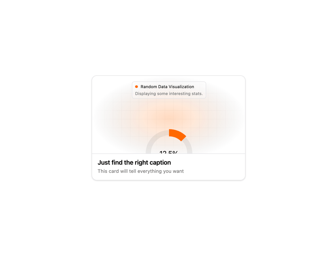
Here is Animated Card Diagram component
Built with React and Tailwind. Copy the prompt and paste it into Claude Code, Cursor or Lovable: your agent adds Animated Card Diagram to your project and fits it to your theme.
Code
How Animated Card Diagram is used: the demo's code. The component's own source comes with a free account.
Usage.tsx
import {
  AnimatedCard,
  CardBody,
  CardDescription,
  CardTitle,
  CardVisual,
} from "@/components/ui/animated-card-diagram"
import { Visual2 } from "@/components/ui/animated-card-diagram"

export default function AnimatedCard2Demo() {
  return (
    <AnimatedCard>
      <CardVisual>
        <Visual2 mainColor="#ff6900" secondaryColor="#f54900" />
      </CardVisual>
      <CardBody>
        <CardTitle>Just find the right caption</CardTitle>
        <CardDescription>
          This card will tell everything you want
        </CardDescription>
      </CardBody>
    </AnimatedCard>
  )
}
Dependencies
More by badtz
View all
Animated Card Chart
1K
Animated Card
465
dock
337
Glowing Button
212
Border Beam
181
Cursor Cards
180
Star Button
86
Cloud Orbit
72
More in Features
View all

Features 8
3.1K
Features 2
322

Grid Feature Cards
1.9K

Feature Sections
52
Feature with advantages
278
Feature Section with card gradient
169
Feature Modern
17
Features 4
368


