
About
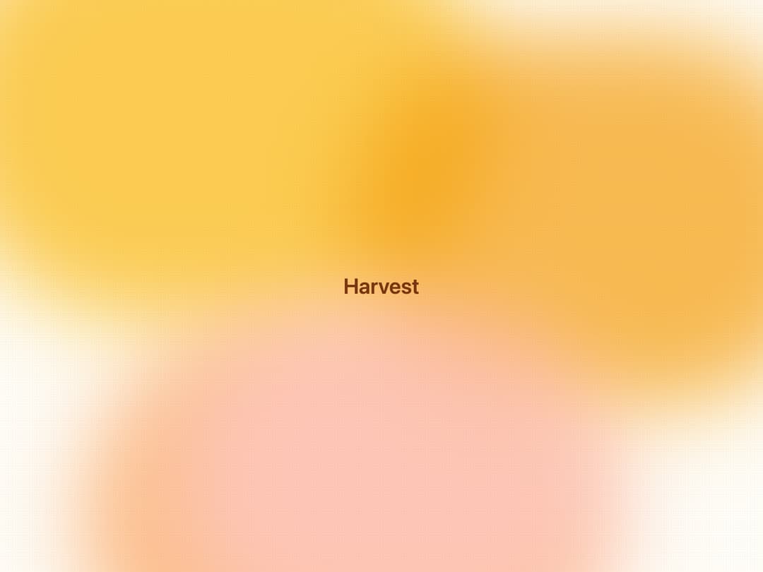
A warm, glowing gradient background wrapper with blurred amber and orange blobs plus a subtle dot-grid texture, used behind hero sections or content that needs a cozy honey-toned backdrop.
Built with React and Tailwind. Copy the prompt and paste it into Claude Code, Cursor or Lovable: your agent adds Honey Ember Background to your project and fits it to your theme.
Code
How Honey Ember Background is used: the demo's code. The component's own source comes with a free account.
Usage.tsx
import { HoneyEmberBackground } from "@/components/ui/honey-ember-background";

export default function HoneyEmberBackgroundDemo() {
  return (
    <HoneyEmberBackground className="min-h-screen w-full flex items-center justify-center p-8">
      <h1 className="text-4xl font-semibold text-[#78350F]">Harvest</h1>
    </HoneyEmberBackground>
  );
}
More by bidyut10
View all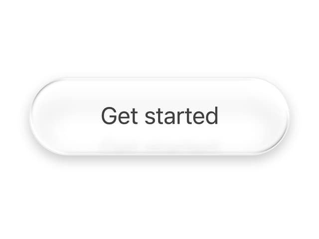
Sheen Pill Button
41
Booking Slot Calendar
27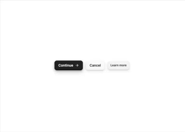
Tactile 3D Button
13
Add to Cart Button
12
Download Button
7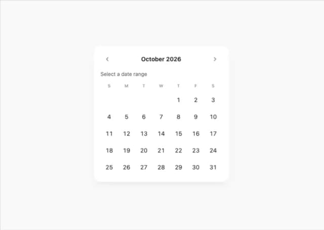
Date Range Picker Card
1
More in Heroes
View all

SaaS Template
2.4K
Centered Hero with Image Fan
930

Hero
1.2K

Responsive Hero Banner
2K

Minimalist Hero Fashion
285

Home Section
66

Hero Section 6
881
Hero Golden Spiral
101
