
About
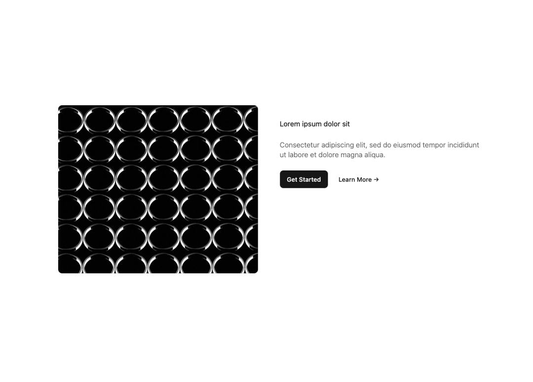
Here is Feature component
Built with React and Tailwind. Copy the prompt and paste it into Claude Code, Cursor or Lovable: your agent adds Feature Modern to your project and fits it to your theme.
Code
How Feature Modern is used: the demo's code. The component's own source comes with a free account.
Usage.tsx
// app/components/Feature.tsx
"use client";

// React / Next
import React from "react";
import Image from "next/image";
import Link from "next/link";
import { Button } from "@/components/ui/button";

// ===== craft-ds (v0.2.8 merged) =====
import { type ClassValue, clsx } from "clsx";
import { twMerge } from "tailwind-merge";

export function cn(...inputs: ClassValue[]) {
  return twMerge(clsx(inputs));
}

type LayoutProps = { children: React.ReactNode; className?: string };
type MainProps = { children: React.ReactNode; className?: string; id?: string };
type SectionProps = { children: React.ReactNode; className?: string; id?: string };
type ContainerProps = { children: React.ReactNode; className?: string; id?: string };
type ArticleProps = {
  children?: React.ReactNode;
  className?: string;
  id?: string;
  dangerouslySetInnerHTML?: { __html: string };
};
type BoxProps = {
  children: React.ReactNode;
  className?: string;
  direction?:
    | "row"
    | "col"
    | { sm?: "row" | "col"; md?: "row" | "col"; lg?: "row" | "col"; xl?: "row" | "col"; "2xl"?: "row" | "col" };
  wrap?:
    | boolean
    | { sm?: boolean; md?: boolean; lg?: boolean; xl?: boolean; "2xl"?: boolean };
  gap?: number | { sm?: number; md?: number; lg?: number; xl?: number; "2xl"?: number };
  cols?: number | { sm?: number; md?: number; lg?: number; xl?: number; "2xl"?: number };
  rows?: number | { sm?: number; md?: number; lg?: number; xl?: number; "2xl"?: number };
};

export const Layout = ({ children, className }: LayoutProps) => (
  <html lang="en" suppressHydrationWarning className={cn("scroll-smooth antialiased focus:scroll-auto", className)}>
    {children}
  </html>
);

export const Main = ({ children, className, id }: MainProps) => (
  <main
    className={cn(
      "max-w-none prose-p:m-0",
      "prose prose-neutral prose:font-sans dark:prose-invert xl:prose-lg",
      "prose-headings:font-normal",
      "prose-strong:font-semibold",
      "prose-a:underline prose-a:decoration-primary/50 prose-a:underline-offset-2 prose-a:text-foreground/75 prose-a:transition-all",
      "hover:prose-a:decoration-primary hover:prose-a:text-foreground",
      "prose-blockquote:not-italic",
      "prose-pre:border prose-pre:bg-muted/25 prose-pre:text-foreground",
      className
    )}
    id={id}
  >
    {children}
  </main>
);

export const Section = ({ children, className, id }: SectionProps) => (
  <section className={cn("py-8 md:py-12", className)} id={id}>
    {children}
  </section>
);

export const Container = ({ children, className, id }: ContainerProps) => (
  <div className={cn("mx-auto max-w-5xl", "p-6 sm:p-8", className)} id={id}>
    {children}
  </div>
);

export const Article = ({ children, className, id, dangerouslySetInnerHTML }: ArticleProps) => (
  <article
    dangerouslySetInnerHTML={dangerouslySetInnerHTML}
    className={cn(
      "prose prose-neutral prose:font-sans dark:prose-invert xl:prose-lg",
      "prose-headings:font-normal",
      "prose-p:mb-0",
      "prose-strong:font-semibold",
      "prose-a:underline prose-a:decoration-primary/50 prose-a:underline-offset-2 prose-a:text-foreground/75 prose-a:transition-all",
      "hover:prose-a:decoration-primary hover:prose-a:text-foreground",
      "prose-blockquote:not-italic",
      "prose-pre:border prose-pre:bg-muted/25",
      className
    )}
    id={id}
  >
    {children}
  </article>
);

export const Box = ({ children, className, direction = "row", wrap = false, gap = 0, cols, rows }: BoxProps) => {
  const directionClasses = { row: "flex-row", col: "flex-col" } as const;
  const wrapClasses = wrap ? "flex-wrap" : "flex-nowrap";
  const gapClasses = { 0: "gap-0", 1: "gap-1", 2: "gap-2", 3: "gap-3", 4: "gap-4", 5: "gap-5", 6: "gap-6", 8: "gap-8", 10: "gap-10", 12: "gap-12" };
  const colsClasses = { 1: "grid-cols-1", 2: "grid-cols-2", 3: "grid-cols-3", 4: "grid-cols-4", 5: "grid-cols-5", 6: "grid-cols-6", 7: "grid-cols-7", 8: "grid-cols-8", 9: "grid-cols-9", 10: "grid-cols-10", 11: "grid-cols-11", 12: "grid-cols-12" };

  const getResponsive = (prop: any, map: Record<string | number, string>) =>
    typeof prop === "object"
      ? Object.entries(prop)
          .map(([bp, val]) => `${bp === "sm" ? "" : `${bp}:`}${map[val as keyof typeof map] || ""}`)
          .join(" ")
      : map[prop as keyof typeof map] || "";

  const stack = cn(
    cols || rows ? "grid" : "flex",
    getResponsive(direction, directionClasses),
    typeof wrap === "boolean" ? wrapClasses : getResponsive(wrap, { true: "flex-wrap", false: "flex-nowrap" } as any),
    getResponsive(gap, gapClasses),
    cols && getResponsive(cols, colsClasses),
    rows && getResponsive(rows, colsClasses),
    className
  );

  return <div className={stack}>{children}</div>;
};

const Placeholder = 'https://components.work/_next/image?url=%2F_next%2Fstatic%2Fmedia%2Fplaceholder.1700a83e.jpg&w=3840&q=75'

export default function Feature() {
  return (
    <Section>
      <Container className="grid items-stretch md:grid-cols-2 md:gap-12">
        <div className="not-prose relative h-96 overflow-hidden rounded-lg border">
          {/* Use fill (boolean) + className for object-fit */}
          <Image src={Placeholder} alt="placeholder" fill className="object-cover" priority />
        </div>

        <div className="flex flex-col gap-6 py-8">
          <h3 className="!my-0">Lorem ipsum dolor sit</h3>
          <p className="font-light leading-[1.4] opacity-70">
            Consectetur adipiscing elit, sed do eiusmod tempor incididunt ut labore et dolore magna aliqua.
          </p>

          <div className="not-prose flex items-center gap-2">
            <Button className="w-fit" asChild>
              <Link href="#">Get Started</Link>
            </Button>
            <Button className="w-fit" variant="link" asChild>
              <Link href="#">Learn More →</Link>
            </Button>
          </div>
        </div>
      </Container>
    </Section>
  );
}
Dependencies
More by brijr
View all
Pricing Section
109
Hero Modern
76
Accordion
17
Call to Action
12
More in Features
View all

Features 8
3.1K
Features 2
322

Grid Feature Cards
1.9K

Feature Sections
52
Feature with advantages
278
Feature Section with card gradient
169
Features 4
368

Framework Agnostic
63

