
About
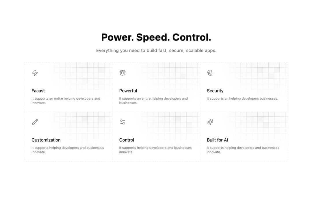
Minimal Features Section using Grid Feature Cards
Built with React and Tailwind. Copy the prompt and paste it into Claude Code, Cursor or Lovable: your agent adds Grid Feature Cards to your project and fits it to your theme.
Code
How Grid Feature Cards is used: the demo's code. The component's own source comes with a free account.
Usage.tsx
'use client';
import { Zap, Cpu, Fingerprint, Pencil, Settings2, Sparkles } from 'lucide-react';
import { motion, useReducedMotion } from 'motion/react';
import { FeatureCard } from '@/components/ui/grid-feature-cards';

const features = [
	{
		title: 'Faaast',
		icon: Zap,
		description: 'It supports an entire helping developers and innovate.',
	},
	{
		title: 'Powerful',
		icon: Cpu,
		description: 'It supports an entire helping developers and businesses.',
	},
	{
		title: 'Security',
		icon: Fingerprint,
		description: 'It supports an helping developers businesses.',
	},
	{
		title: 'Customization',
		icon: Pencil,
		description: 'It supports helping developers and businesses innovate.',
	},
	{
		title: 'Control',
		icon: Settings2,
		description: 'It supports helping developers and businesses innovate.',
	},
	{
		title: 'Built for AI',
		icon: Sparkles,
		description: 'It supports helping developers and businesses innovate.',
	},
];

export default function DemoOne() {
	return (
		<section className="py-16 md:py-32">
			<div className="mx-auto w-full max-w-5xl space-y-8 px-4">
				<AnimatedContainer className="mx-auto max-w-3xl text-center">
					<h2 className="text-3xl font-bold tracking-wide text-balance md:text-4xl lg:text-5xl xl:font-extrabold">
						Power. Speed. Control.
					</h2>
					<p className="text-muted-foreground mt-4 text-sm tracking-wide text-balance md:text-base">
						Everything you need to build fast, secure, scalable apps.
					</p>
				</AnimatedContainer>

				<AnimatedContainer
					delay={0.4}
					className="grid grid-cols-1 divide-x divide-y divide-dashed border border-dashed sm:grid-cols-2 md:grid-cols-3"
				>
					{features.map((feature, i) => (
						<FeatureCard key={i} feature={feature} />
					))}
				</AnimatedContainer>
			</div>
		</section>
	);
}

type ViewAnimationProps = {
	delay?: number;
	className?: React.ComponentProps<typeof motion.div>['className'];
	children: React.ReactNode;
};

function AnimatedContainer({ className, delay = 0.1, children }: ViewAnimationProps) {
	const shouldReduceMotion = useReducedMotion();

	if (shouldReduceMotion) {
		return children;
	}

	return (
		<motion.div
			initial={{ filter: 'blur(4px)', translateY: -8, opacity: 0 }}
			whileInView={{ filter: 'blur(0px)', translateY: 0, opacity: 1 }}
			viewport={{ once: true }}
			transition={{ delay, duration: 0.8 }}
			className={className}
		>
			{children}
		</motion.div>
	);
}
More by Efferd
View all

Testimonials Columns
7.1K
Zoom Parallax
5.2K
Dotted Surface
3.5K
Footer Section
2.7K
Logo Cloud 2
1.6K
Header 3
1.5K
Logo Cloud 3
1.5K
Image Gallery
1.1K
More in Features
View all

Features 8
3K
Features 2
321

Feature Sections
52
Feature Modern
17
Feature with advantages
278
Feature Section with card gradient
169
Features 4
367

Features Grid
78


