
About
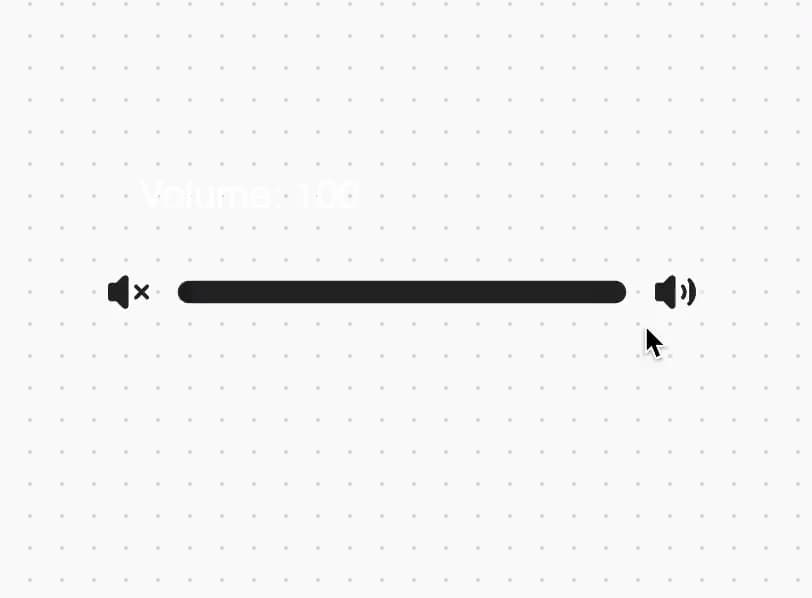
A draggable control that uses rubber banding for out-of-bounds feedback.
Built with React and Tailwind. Copy the prompt and paste it into Claude Code, Cursor or Lovable: your agent adds Slider to your project and fits it to your theme.
Code
How Slider is used: the demo's code. The component's own source comes with a free account.
Usage.tsx
"use client";

import { useState } from "react";
import { Slider } from "@/components/ui/slider";

function SliderDemo() {
  const [volume, setVolume] = useState(50);

  return (
    <div className="p-8">
      <h1 className="mb-4 text-xl text-white">Volume: {volume}</h1>
      <Slider value={volume} onChange={setVolume} />
    </div>
  );
}

export { SliderDemo };
Dependencies
More by Build UI
View all
Filesystem Item
574
Animated Text
210
Animated Tabs
85
Animated Counter
79
iOS Animated Switch
6