About
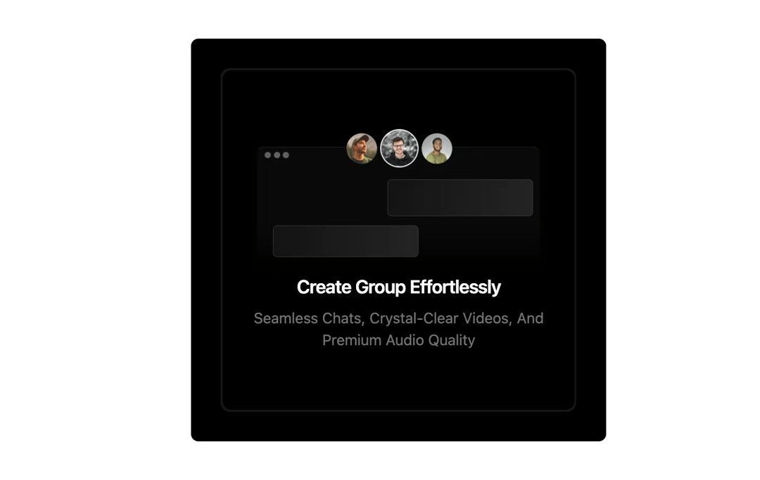
Interactive cards with a radial mouse-following spotlight glow, supporting proximity, hover-focus, and cursor-flow gradient lighting effects.
Built with React and Tailwind. Copy the prompt and paste it into Claude Code, Cursor or Lovable: your agent adds Spotlight Cards to your project and fits it to your theme.
Code
How Spotlight Cards is used: the demo's code. The component's own source comes with a free account.
Usage.tsx
'use client';
import { SpotLightItem, Spotlight } from '@/components/ui/spotlight';
import Image from 'next/image';
import React from 'react';

export default function SpotlightCard2() {
  return (
    <div className='relative bg-black sm:p-8 px-4 rounded-md'>
      <Spotlight className='sm:w-96 w-full' ProximitySpotlight={false}>
        <SpotLightItem>
          <div className='relative text-center z-10 px-0 py-16 rounded-lg w-full bg-cover bg-black h-full mx-auto'>
            <Image src={'https://cdn.21st.dev/assets/mirror/fc/fc9afab13fbf8f43f55a8804f39a48cd533857f5befe3b7db8bee9a0d6a63260.webp'} alt='grid' width={600} className='mx-auto w-[85%]' height={600} />
            <h1 className='text-xl font-semibold tracking-tight text-white'>Create Group Effortlessly</h1>
            <p className='pt-2 lg:text-base text-sm text-muted-foreground capitalize'>
              Seamless chats, crystal-clear videos, and <br />
              premium audio quality
            </p>
          </div>
        </SpotLightItem>
      </Spotlight>
    </div>
  );
}
Dependencies
More by Claude
View all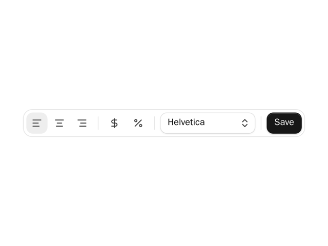

Formatting Toolbar
2
More in Features
View all

Features 8
3.1K

Feature Sections
107

Grid Feature Cards
1.9K

Feature 72
122
Features 2
322
Features 4
368
Feature Modern
9
Features Card
201

