
About
Here is Buttons Components
Built with React and Tailwind. Copy the prompt and paste it into Claude Code, Cursor or Lovable: your agent adds Buttons to your project and fits it to your theme.
Code
How Buttons is used: the demo's code. The component's own source comes with a free account.
Usage.tsx
import { Button } from '@/components/ui/button'

const ButtonLargeDemo = () => {
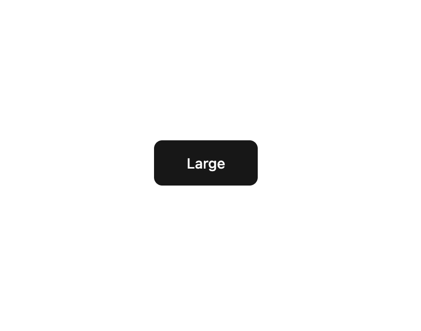
  return <Button size='lg'>Large</Button>
}

export default ButtonLargeDemo
More by Clevision
View all

Calendar
106
Card Studio
99
Collapsible
43
Button Group
37
Radio Group 1
30
Combobox
27
Basic Avatar
24
Switch
23
More in Buttons
View all

Button
14
Button
34
Texture Button
92
Button Save
46

Button
64

App Store Button
454

Notification Button
103
Native Button
12


