
About
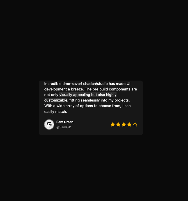
Here is Card component
Built with React and Tailwind. Copy the prompt and paste it into Claude Code, Cursor or Lovable: your agent adds Card Studio to your project and fits it to your theme.
Code
How Card Studio is used: the demo's code. The component's own source comes with a free account.
Usage.tsx
import { StarIcon } from 'lucide-react'

import { Avatar, AvatarFallback, AvatarImage } from '@/components/ui/avatar'
import { Card, CardFooter, CardContent, CardTitle, CardDescription } from '@/components/ui/card'

const CardTestimonialDemo = () => {
  return (
    <Card className='max-w-md border-none'>
      <CardContent>
        <p>
          Incredible time-saver! shadcn/studio has made UI development a breeze. The pre build components are not only{' '}
          <span className='bg-primary/10'>visually appealing but also highly customizable</span>, fitting seamlessly
          into my projects. With a wide array of options to choose from, I can easily match.
        </p>
      </CardContent>
      <CardFooter className='justify-between gap-3 max-sm:flex-col max-sm:items-stretch'>
        <div className='flex items-center gap-3'>
          <Avatar className='ring-ring ring-2'>
            <AvatarImage src='https://cdn.21st.dev/assets/mirror/ec/ec81be4cc810190ce4d240fcc57295965c5cebaa8751558595ade91eb62c09a4.png' alt='Hallie Richards' />
            <AvatarFallback className='text-xs'>SG</AvatarFallback>
          </Avatar>
          <div className='flex flex-col gap-0.5'>
            <CardTitle className='flex items-center gap-1 text-sm'>Sam Green</CardTitle>
            <CardDescription>@SamG11</CardDescription>
          </div>
        </div>
        <div className='flex items-center gap-1'>
          <StarIcon className='size-5 fill-amber-500 stroke-amber-500 dark:fill-amber-400 dark:stroke-amber-400'></StarIcon>
          <StarIcon className='size-5 fill-amber-500 stroke-amber-500 dark:fill-amber-400 dark:stroke-amber-400'></StarIcon>
          <StarIcon className='size-5 fill-amber-500 stroke-amber-500 dark:fill-amber-400 dark:stroke-amber-400'></StarIcon>
          <StarIcon className='size-5 fill-amber-500 stroke-amber-500 dark:fill-amber-400 dark:stroke-amber-400'></StarIcon>
          <StarIcon className='size-5 stroke-amber-500 dark:stroke-amber-400'></StarIcon>
        </div>
      </CardFooter>
    </Card>
  )
}

export default CardTestimonialDemo
More by Clevision
View all

Calendar
106
Collapsible
43
Button Group
37
Buttons
33
Radio Group 1
30
Combobox
27
Basic Avatar
24
Switch
23
More in Testimonials
View all

Testimonial
117
testimonial
797

Staggered Testimonials Grid
143
Testimonial 2
32

Voice Testimonial
120
Testimonial Card
69

Split Sign In Form
16
Testimonials Marquee
574


