
About
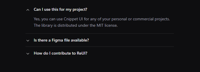
A set of collapsible panels with headings.
Built with React and Tailwind. Copy the prompt and paste it into Claude Code, Cursor or Lovable: your agent adds Accordion to your project and fits it to your theme.
Code
How Accordion is used: the demo's code. The component's own source comes with a free account.
Usage.tsx
import {
  Accordion,
  AccordionContent,
  AccordionItem,
  AccordionPanel,
  AccordionTrigger,
} from "@/components/ui/accordion";
import { Minus, Plus } from "lucide-react";

const items = [
  {
    content:
      "Yes, you can use Cnippet UI for any of your personal or commercial projects. The library is distributed under the MIT license.",
    trigger: "Can I use this for my project?",
    value: "item-1",
  },
  {
    content:
      "We are currently working on a comprehensive Figma design system that will be released soon to all Cnippet UI users.",
    trigger: "Is there a Figma file available?",
    value: "item-2",
  },
  {
    content:
      "You can contribute by reporting bugs, suggesting features, or submitting pull requests on our GitHub repository.",
    trigger: "How do I contribute to Cnippet UI?",
    value: "item-3",
  },
];

export default function Component() {
  return (
    <section className="space-y-6">
    <div>
    <div className="text-xl">With plus/minus icons</div>
    <div className="mx-auto mb-auto w-full max-w-lg">
      <Accordion defaultValue={["security"]}>
        {items.map((item) => (
          <AccordionItem key={item.value} value={item.value}>
            <AccordionTrigger
              className="hover:no-underline"
              icon={
                <div className="flex h-7 w-7 items-center justify-center">
                  <Plus className="in-data-panel-open:hidden" size={16} />
                  <Minus
                    className="in-data-panel-open:block hidden"
                    size={16}
                  />
                </div>
              }
            >
              <span>{item.trigger}</span>
            </AccordionTrigger>
            <AccordionContent>{item.content}</AccordionContent>
          </AccordionItem>
        ))}
      </Accordion>
    </div>
    </div>

    <div>
    <div className="text-xl">Multiple Accordion</div>
    <div className="mx-auto mb-auto w-full max-w-lg">
      <Accordion className="md:w-md" multiple>
      <AccordionItem value="item-1">
        <AccordionTrigger>What is Cnippet UI?</AccordionTrigger>
        <AccordionPanel>
          Cnippet UI is a library of high-quality unstyled React components for
          design systems and web apps.
        </AccordionPanel>
      </AccordionItem>
      <AccordionItem value="item-2">
        <AccordionTrigger>How do I get started?</AccordionTrigger>
        <AccordionPanel>
          Head to the "Quick start" guide in the docs. If you've used unstyled
          libraries before, you'll feel at home.
        </AccordionPanel>
      </AccordionItem>
      <AccordionItem value="item-3">
        <AccordionTrigger>Can I use it for my project?</AccordionTrigger>
        <AccordionPanel>
          Of course! Cnippet UI is free and open source.
        </AccordionPanel>
      </AccordionItem>
    </Accordion>
    </div>
    </div>

    <div>
    <div className="text-xl">With rotating arrow indicator</div>
    <div className="mx-auto mb-auto w-full max-w-lg">
      <Accordion defaultValue={["item-1"]} multiple={false}>
        {items.map((item) => (
          <AccordionItem key={item.value} value={item.value}>
            <AccordionTrigger className="flex-row-reverse items-center justify-end gap-3 py-3 hover:no-underline *:data-[slot=accordion-trigger-icon]:hidden">
              <span className="font-medium text-foreground/90">
                {item.trigger}
              </span>
            </AccordionTrigger>
            <AccordionContent className="ps-7 text-muted-foreground leading-relaxed">
              {item.content}
            </AccordionContent>
          </AccordionItem>
        ))}
      </Accordion>
    </div>
    </div>
    </section>
  );
}
Dependencies
More by Cnippet
View all

Team
1.3K
Davincho Hero-1
681
Aero Hero-3
556
Features
507
Random Letter Swap Navigation
482
Services with Animated Hover Modal
463
Blogs
396
Aero Hero-1
355