
About
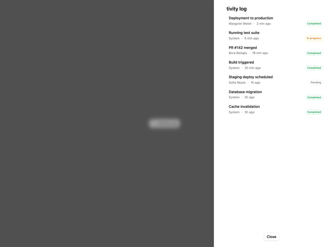
A right-side drawer that shows a scrollable activity log as a vertical status timeline with completed, in-progress, and pending states.
Built with React and Tailwind. Copy the prompt and paste it into Claude Code, Cursor or Lovable: your agent adds Activity Log Drawer to your project and fits it to your theme.
Code
How Activity Log Drawer is used: the demo's code. The component's own source comes with a free account.
Usage.tsx
"use client";

import {
  ActivityIcon,
  CheckCircle2Icon,
  CircleIcon,
  ClockIcon,
} from "lucide-react";
import { Button } from "@/components/ui/button";
import {
  Drawer,
  DrawerClose,
  DrawerFooter,
  DrawerHeader,
  DrawerPanel,
  DrawerPopup,
  DrawerTitle,
  DrawerTrigger,
} from "@/components/ui/activity-log-drawer-utils/drawer";

type Status = "completed" | "in_progress" | "pending";

const EVENTS: {
  id: number;
  action: string;
  user: string;
  time: string;
  status: Status;
}[] = [
  {
    action: "Deployment to production",
    id: 1,
    status: "completed",
    time: "2 min ago",
    user: "Margaret Welsh",
  },
  {
    action: "Running test suite",
    id: 2,
    status: "in_progress",
    time: "5 min ago",
    user: "System",
  },
  {
    action: "PR #142 merged",
    id: 3,
    status: "completed",
    time: "18 min ago",
    user: "Bora Baloglu",
  },
  {
    action: "Build triggered",
    id: 4,
    status: "completed",
    time: "20 min ago",
    user: "System",
  },
  {
    action: "Staging deploy scheduled",
    id: 5,
    status: "pending",
    time: "1h ago",
    user: "Sofia Reyes",
  },
  {
    action: "Database migration",
    id: 6,
    status: "completed",
    time: "2h ago",
    user: "System",
  },
  {
    action: "Cache invalidation",
    id: 7,
    status: "completed",
    time: "3h ago",
    user: "System",
  },
];

const STATUS_CONFIG: Record<
  Status,
  { icon: typeof CheckCircle2Icon; color: string; label: string }
> = {
  completed: {
    color: "text-green-500",
    icon: CheckCircle2Icon,
    label: "Completed",
  },
  in_progress: {
    color: "text-amber-500",
    icon: ClockIcon,
    label: "In progress",
  },
  pending: {
    color: "text-muted-foreground",
    icon: CircleIcon,
    label: "Pending",
  },
};

export default function Default() {
  return (
    <div className="flex min-h-[400px] w-full items-center justify-center">
      <Drawer position="right" defaultOpen>
        <DrawerTrigger render={<Button variant="outline" />}>
          <ActivityIcon className="size-4" />
          Activity log
        </DrawerTrigger>
        <DrawerPopup showCloseButton variant="straight">
          <DrawerHeader>
            <DrawerTitle>Activity log</DrawerTitle>
          </DrawerHeader>
          <DrawerPanel>
            <ol className="relative ml-3 space-y-4 border-border border-l">
              {EVENTS.map((event) => {
                const {
                  icon: Icon,
                  color,
                  label,
                } = STATUS_CONFIG[event.status];
                return (
                  <li className="ml-5" key={event.id}>
                    <span className="absolute -left-1.5 flex size-3 items-center justify-center rounded-full bg-background">
                      <Icon className={`size-3.5 ${color}`} />
                    </span>
                    <div className="space-y-0.5">
                      <p className="font-medium text-sm">{event.action}</p>
                      <div className="flex items-center gap-2 text-muted-foreground text-xs">
                        <span>{event.user}</span>
                        <span>·</span>
                        <span>{event.time}</span>
                        <span
                          className={`ml-auto rounded-full border px-1.5 py-0.5 font-medium text-[10px] ${
                            event.status === "completed"
                              ? "border-green-200 text-green-600 dark:border-green-800 dark:text-green-400"
                              : event.status === "in_progress"
                                ? "border-amber-200 text-amber-600 dark:border-amber-800 dark:text-amber-400"
                                : "border-border text-muted-foreground"
                          }`}
                        >
                          {label}
                        </span>
                      </div>
                    </div>
                  </li>
                );
              })}
            </ol>
          </DrawerPanel>
          <DrawerFooter
            className="justify-center sm:justify-center"
            variant="bare"
          >
            <DrawerClose render={<Button variant="outline" />}>
              Close
            </DrawerClose>
          </DrawerFooter>
        </DrawerPopup>
      </Drawer>
    </div>
  );
}
Dependencies
More by Cnippet
View all

Team
1.3K
Davincho Hero-1
683
Aero Hero-3
559
Features
510
Random Letter Swap Navigation
487
Services with Animated Hover Modal
465
Blogs
396
Aero Hero-1
356