
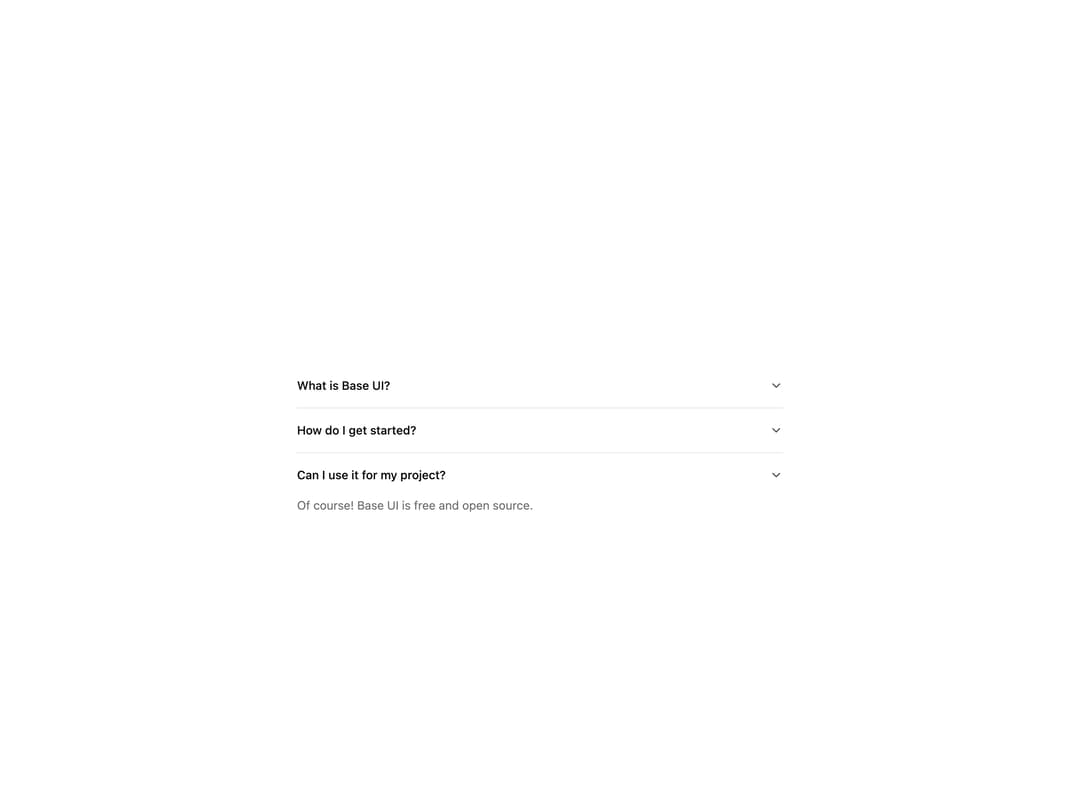
About
A vertically stacked set of collapsible sections built on Base UI's Accordion primitive. Supports single or multiple open items, controlled or uncontrolled state, a custom trigger icon, smooth height-animated panels, and nesting. Ships Accordion, AccordionItem, AccordionTrigger and AccordionPanel (also exported as AccordionContent).
Built with React and Tailwind. Copy the prompt and paste it into Claude Code, Cursor or Lovable: your agent adds Accordion to your project and fits it to your theme.
Code
How Accordion is used: the demo's code. The component's own source comes with a free account.
Usage.tsx
import {
  Accordion,
  AccordionItem,
  AccordionPanel,
  AccordionTrigger,
} from "@/components/ui/cnippet-accordion";

export default function AccordionDemo() {
  const items = [
    {
      content:
        "Base UI is a library of high-quality unstyled React components for design systems and web apps.",
      id: "1",
      title: "What is Base UI?",
    },
    {
      content:
        "Head to the \"Quick start\" guide in the docs. If you've used unstyled libraries before, you'll feel at home.",
      id: "2",
      title: "How do I get started?",
    },
    {
      content: "Of course! Base UI is free and open source.",
      id: "3",
      title: "Can I use it for my project?",
    },
  ];

  return (
    <Accordion className="mx-auto w-full max-w-xl" defaultValue={["3"]}>
      {items.map((item) => (
        <AccordionItem key={item.id} value={item.id}>
          <AccordionTrigger>{item.title}</AccordionTrigger>
          <AccordionPanel>{item.content}</AccordionPanel>
        </AccordionItem>
      ))}
    </Accordion>
  );
}
Dependencies
More by Cnippet
View all

Team
1.3K
Davincho Hero-1
683
Aero Hero-3
558
Features
510
Random Letter Swap Navigation
487
Services with Animated Hover Modal
465
Blogs
396
Aero Hero-1
356