
About
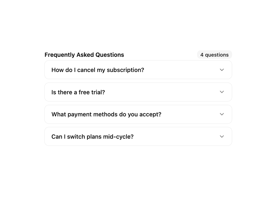
A minimal show/hide primitive built on Base UI's Collapsible. A trigger toggles a height-animated panel — perfect for read-more text, FAQ rows, nested groups and expandable log output. Controlled or uncontrolled via open / defaultOpen, with data-panel-open styling hooks. Ships Collapsible, CollapsibleTrigger and CollapsiblePanel (also exported as CollapsibleContent).
Built with React and Tailwind. Copy the prompt and paste it into Claude Code, Cursor or Lovable: your agent adds Collapsible to your project and fits it to your theme.
Code
How Collapsible is used: the demo's code. The component's own source comes with a free account.
Usage.tsx
"use client";

import { ChevronDownIcon } from "lucide-react";
import { useState } from "react";
import {
  Collapsible,
  CollapsiblePanel,
  CollapsibleTrigger,
} from "@/components/ui/cnippet-collapsible";

const FAQS = [
  {
    answer:
      "You can cancel at any time from your account settings. Your subscription remains active until the end of the current billing period.",
    id: "cancel",
    question: "How do I cancel my subscription?",
  },
  {
    answer:
      "Yes — we offer a 14-day free trial with no credit card required. You get full access to all Pro features during the trial.",
    id: "trial",
    question: "Is there a free trial?",
  },
  {
    answer:
      "We accept Visa, Mastercard, American Express, and PayPal. All transactions are secured with TLS encryption.",
    id: "payment",
    question: "What payment methods do you accept?",
  },
  {
    answer:
      "Absolutely. You can upgrade or downgrade your plan at any time and the price difference will be prorated automatically.",
    id: "switch",
    question: "Can I switch plans mid-cycle?",
  },
];

export default function CollapsibleFaq() {
  const [open, setOpen] = useState<string | null>(null);

  return (
    <div className="w-full max-w-md space-y-2">
      <div className="mb-1 flex items-center justify-between">
        <p className="font-semibold text-sm">Frequently Asked Questions</p>
        <span className="inline-flex items-center rounded-md bg-secondary px-2 py-0.5 font-medium text-secondary-foreground text-xs">
          {FAQS.length} questions
        </span>
      </div>
      {FAQS.map((faq) => (
        <Collapsible
          key={faq.id}
          onOpenChange={(o) => setOpen(o ? faq.id : null)}
          open={open === faq.id}
        >
          <CollapsibleTrigger className="flex w-full items-center justify-between rounded-lg border px-4 py-3 text-left font-medium text-sm transition-colors hover:bg-muted/50">
            {faq.question}
            <ChevronDownIcon className="size-4 shrink-0 in-data-panel-open:rotate-180 text-muted-foreground transition-transform duration-200" />
          </CollapsibleTrigger>
          <CollapsiblePanel>
            <div className="rounded-b-lg border border-t-0 bg-muted/30 px-4 py-3 text-muted-foreground text-sm leading-relaxed">
              {faq.answer}
            </div>
          </CollapsiblePanel>
        </Collapsible>
      ))}
    </div>
  );
}
Dependencies
More by Cnippet
View all

Team
1.3K
Davincho Hero-1
683
Aero Hero-3
558
Features
510
Random Letter Swap Navigation
487
Services with Animated Hover Modal
465
Blogs
396
Aero Hero-1
356