
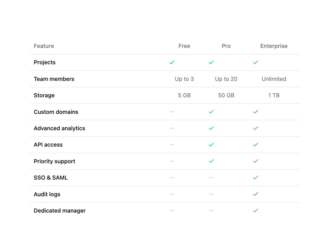
About
A styled, responsive table primitive with default and card variants. Ships Table, TableHeader, TableBody, TableFooter, TableRow, TableHead, TableCell and TableCaption — semantic <table> elements with hover and selected row states, a horizontal-scroll container, and a rounded 'card' layout. Dependency-free (just cn). Compose it for project lists, invoices, inventory, API metrics, server usage, subscriptions or pricing comparisons.
Built with React and Tailwind. Copy the prompt and paste it into Claude Code, Cursor or Lovable: your agent adds Table to your project and fits it to your theme.
Code
How Table is used: the demo's code. The component's own source comes with a free account.
Usage.tsx
import { CheckIcon, MinusIcon } from "lucide-react";
import {
  Table,
  TableBody,
  TableCell,
  TableHead,
  TableHeader,
  TableRow,
} from "@/components/ui/cnippet-table";

const features: {
  enterprise: boolean | string;
  free: boolean | string;
  name: string;
  pro: boolean | string;
}[] = [
  { enterprise: true, free: true, name: "Projects", pro: true },
  {
    enterprise: "Unlimited",
    free: "Up to 3",
    name: "Team members",
    pro: "Up to 20",
  },
  { enterprise: "1 TB", free: "5 GB", name: "Storage", pro: "50 GB" },
  { enterprise: true, free: false, name: "Custom domains", pro: true },
  { enterprise: true, free: false, name: "Advanced analytics", pro: true },
  { enterprise: true, free: false, name: "API access", pro: true },
  { enterprise: true, free: false, name: "Priority support", pro: true },
  { enterprise: true, free: false, name: "SSO & SAML", pro: false },
  { enterprise: true, free: false, name: "Audit logs", pro: false },
  { enterprise: true, free: false, name: "Dedicated manager", pro: false },
];

function FeatureCell({ value }: { value: boolean | string }) {
  if (typeof value === "string") {
    return <span className="text-muted-foreground text-sm">{value}</span>;
  }
  return value ? (
    <CheckIcon className="size-4 text-emerald-500" />
  ) : (
    <MinusIcon className="size-4 text-muted-foreground/40" />
  );
}

export default function TablePricing() {
  return (
    <div className="mx-auto w-full max-w-2xl">
      <Table>
        <TableHeader>
          <TableRow>
            <TableHead className="w-1/2">Feature</TableHead>
            <TableHead className="text-center">Free</TableHead>
            <TableHead className="text-center">Pro</TableHead>
            <TableHead className="text-center">Enterprise</TableHead>
          </TableRow>
        </TableHeader>
        <TableBody>
          {features.map((f) => (
            <TableRow key={f.name}>
              <TableCell className="font-medium text-sm">{f.name}</TableCell>
              <TableCell className="text-center">
                <FeatureCell value={f.free} />
              </TableCell>
              <TableCell className="text-center">
                <FeatureCell value={f.pro} />
              </TableCell>
              <TableCell className="text-center">
                <FeatureCell value={f.enterprise} />
              </TableCell>
            </TableRow>
          ))}
        </TableBody>
      </Table>
    </div>
  );
}
More by Cnippet
View all

Team
1.3K
Davincho Hero-1
683
Aero Hero-3
558
Features
510
Random Letter Swap Navigation
487
Services with Animated Hover Modal
465
Blogs
396
Aero Hero-1
356
More in Pricing
View all
Pricing Section
582

Pricing Cards
31

Pricing Card
535

Pricing Section
173
pricing section
158
Single Pricing Card
795

Pricing
125
Glowing Pricing Tiers
45


