
About
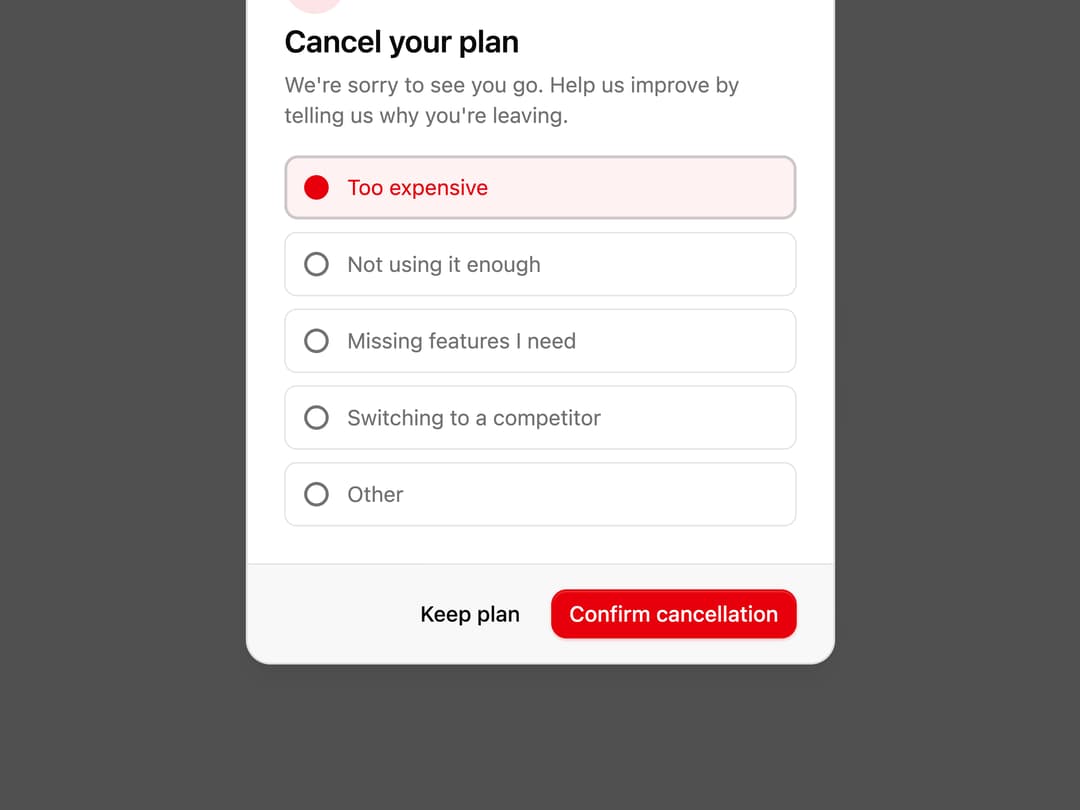
A subscription cancellation dialog that asks the user to pick a reason before confirming the cancellation.
Built with React and Tailwind. Copy the prompt and paste it into Claude Code, Cursor or Lovable: your agent adds Subscription Cancellation Dialog to your project and fits it to your theme.
Code
How Subscription Cancellation Dialog is used: the demo's code. The component's own source comes with a free account.
Usage.tsx
"use client";
import { AlertTriangleIcon } from "lucide-react";
import { useState } from "react";
import { Button } from "@/components/ui/button";
import {
Dialog,
DialogClose,
DialogDescription,
DialogFooter,
DialogHeader,
DialogPanel,
DialogPopup,
DialogTitle,
DialogTrigger,
} from "@/components/ui/subscription-cancellation-dialog-utils/dialog";
const REASONS = [
"Too expensive",
"Not using it enough",
"Missing features I need",
"Switching to a competitor",
"Other",
];
function CancelSubscriptionDialog() {
const [reason, setReason] = useState("Too expensive");
return (
<Dialog defaultOpen>
<DialogTrigger render={<Button variant="outline" />}>
Cancel subscription
</DialogTrigger>
<DialogPopup className="sm:max-w-sm">
<DialogHeader>
<div className="flex size-10 items-center justify-center rounded-full bg-destructive/10">
<AlertTriangleIcon className="size-5 text-destructive" />
</div>
<DialogTitle>Cancel your plan</DialogTitle>
<DialogDescription>
We're sorry to see you go. Help us improve by telling us why
you're leaving.
</DialogDescription>
</DialogHeader>
<DialogPanel className="space-y-2">
{REASONS.map((r) => (
<button
className={`flex w-full items-center gap-3 rounded-md border px-3 py-2.5 text-left text-sm transition-colors ${
reason === r
? "border-destructive bg-destructive/5 text-destructive"
: "text-muted-foreground hover:border-foreground/20 hover:text-foreground"
}`}
key={r}
onClick={() => setReason(r)}
type="button"
>
<span
className={`size-4 shrink-0 rounded-full border-2 ${
reason === r
? "border-destructive bg-destructive"
: "border-muted-foreground"
}`}
/>
{r}
</button>
))}
</DialogPanel>
<DialogFooter>
<DialogClose render={<Button variant="ghost" />}>
Keep plan
</DialogClose>
<Button disabled={!reason} variant="destructive">
Confirm cancellation
</Button>
</DialogFooter>
</DialogPopup>
</Dialog>
);
}
export default function Default() {
return (
<div className="flex min-h-[400px] w-full items-center justify-center p-6">
<CancelSubscriptionDialog />
</div>
);
}
Dependencies
More by Cnippet
View all

Team
1.3K
Davincho Hero-1
683
Aero Hero-3
558
Features
510
Random Letter Swap Navigation
487
Services with Animated Hover Modal
465
Blogs
396
Aero Hero-1
356