

About
A pricing card with a collapsible section that reveals advanced input fields such as tax rate and discount.
Built with React and Tailwind. Copy the prompt and paste it into Claude Code, Cursor or Lovable: your agent adds Collapsible Form Fields to your project and fits it to your theme.
Code
How Collapsible Form Fields is used: the demo's code. The component's own source comes with a free account.
Usage.tsx
"use client";

import { Settings2Icon } from "lucide-react";
import { useState } from "react";
import { Button } from "@/components/ui/v-collapsible-5-utils/button";
import {
  Card,
  CardContent,
  CardHeader,
  CardTitle,
} from "@/components/ui/v-collapsible-5-utils/card";
import {
  Collapsible,
  CollapsibleContent,
  CollapsibleTrigger,
} from "@/components/ui/v-collapsible-5-utils/collapsible";
import { Field, FieldLabel } from "@/components/ui/v-collapsible-5-utils/field";
import {
  InputGroup,
  InputGroupAddon,
  InputGroupInput,
  InputGroupText,
} from "@/components/ui/v-collapsible-5-utils/input-group";

function Pattern() {
  const [isOpen, setIsOpen] = useState(true);

  return (
    <div className="w-full max-w-xs">
      <Card>
        <CardHeader>
          <CardTitle>Unit Pricing</CardTitle>
        </CardHeader>
        <CardContent>
          <Collapsible
            className="flex flex-col gap-3"
            onOpenChange={setIsOpen}
            open={isOpen}
          >
            <div className="flex items-end gap-2">
              <Field className="flex-1">
                <FieldLabel className="sr-only">Base Price</FieldLabel>
                <InputGroup>
                  <InputGroupInput
                    defaultValue="19.00"
                    placeholder="0.00"
                    type="number"
                  />
                  <InputGroupAddon align="inline-end">
                    <InputGroupText>$</InputGroupText>
                  </InputGroupAddon>
                </InputGroup>
              </Field>
              <CollapsibleTrigger
                render={
                  <Button className="shrink-0" size="icon" variant="outline" />
                }
              >
                <Settings2Icon aria-hidden="true" className="size-3.5" />
              </CollapsibleTrigger>
            </div>

            <CollapsibleContent className="flex flex-col gap-3 data-[state=closed]:animate-collapsible-up data-[state=open]:animate-collapsible-down">
              <Field>
                <FieldLabel>Tax Rate (%)</FieldLabel>
                <InputGroup>
                  <InputGroupInput
                    defaultValue="15"
                    placeholder="0"
                    type="number"
                  />
                  <InputGroupAddon align="inline-end">
                    <InputGroupText>%</InputGroupText>
                  </InputGroupAddon>
                </InputGroup>
              </Field>
              <Field>
                <FieldLabel>Discount (%)</FieldLabel>
                <InputGroup>
                  <InputGroupInput
                    defaultValue="0"
                    placeholder="0"
                    type="number"
                  />
                  <InputGroupAddon align="inline-end">
                    <InputGroupText>%</InputGroupText>
                  </InputGroupAddon>
                </InputGroup>
              </Field>
            </CollapsibleContent>
          </Collapsible>
        </CardContent>
      </Card>
    </div>
  );
}

export default function Default() {
  return (
    <div className="flex min-h-[420px] w-full items-center justify-center p-6">
      <Pattern />
    </div>
  );
}
Dependencies
More by Cnippet
View all

Team
1.3K
Davincho Hero-1
681
Aero Hero-3
553
Features
506
Random Letter Swap Navigation
480
Services with Animated Hover Modal
462
Blogs
396
Aero Hero-1
354
More in Pricing
View all
Pricing Section
570

Pricing Section
171

Pricing Cards
16

Pricing Card
532
pricing section
156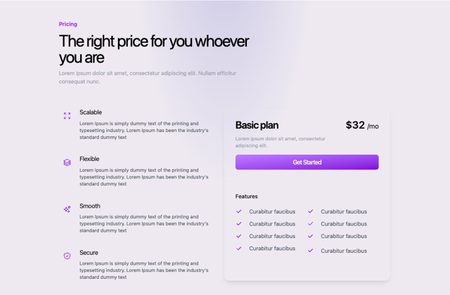
Colorful-Pricing
84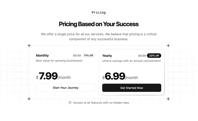
Single Pricing Card
792
Login Card
5


