
About
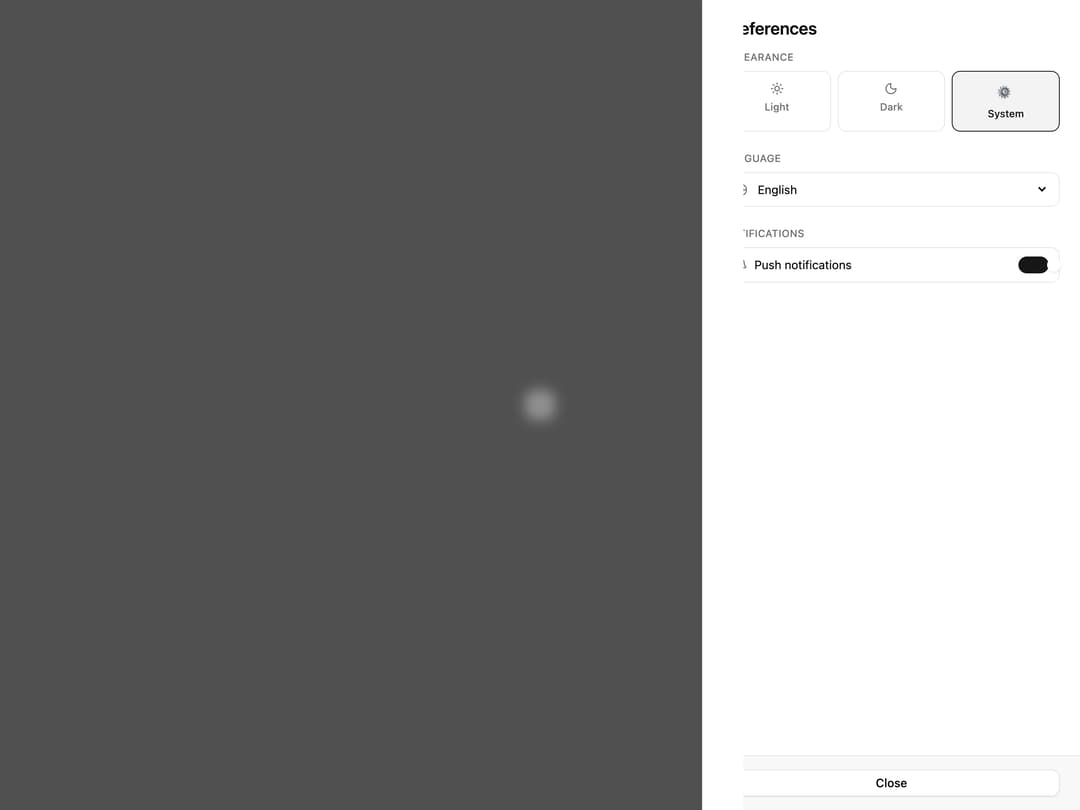
A side drawer panel for user preferences with appearance/theme, language and notification settings, triggered by a settings button.
Built with React and Tailwind. Copy the prompt and paste it into Claude Code, Cursor or Lovable: your agent adds Preferences Drawer to your project and fits it to your theme.
Code
How Preferences Drawer is used: the demo's code. The component's own source comes with a free account.
Usage.tsx
"use client";

import {
  BellIcon,
  GlobeIcon,
  MoonIcon,
  SettingsIcon,
  SunIcon,
} from "lucide-react";
import { useState } from "react";
import { Button } from "@/components/ui/v-drawer-11-utils/button";
import {
  Drawer,
  DrawerClose,
  DrawerFooter,
  DrawerHeader,
  DrawerPanel,
  DrawerPopup,
  DrawerTitle,
  DrawerTrigger,
} from "@/components/ui/v-drawer-11-utils/drawer";

function Particle() {
  const [theme, setTheme] = useState<"light" | "dark" | "system">("system");
  const [language, setLanguage] = useState("English");
  const [notifs, setNotifs] = useState(true);

  return (
    <Drawer position="right" defaultOpen>
      <DrawerTrigger render={<Button size="icon" variant="outline" />}>
        <SettingsIcon className="size-4" />
      </DrawerTrigger>
      <DrawerPopup showCloseButton variant="straight">
        <DrawerHeader>
          <DrawerTitle>Preferences</DrawerTitle>
        </DrawerHeader>
        <DrawerPanel className="space-y-6">
          <div className="space-y-2">
            <p className="font-medium text-muted-foreground text-xs uppercase tracking-wide">
              Appearance
            </p>
            <div className="grid grid-cols-3 gap-2">
              {(["light", "dark", "system"] as const).map((t) => (
                <button
                  className={`flex flex-col items-center gap-1.5 rounded-lg border p-3 font-medium text-xs transition-colors ${
                    theme === t
                      ? "border-primary bg-primary/5 text-primary"
                      : "text-muted-foreground hover:border-foreground/20"
                  }`}
                  key={t}
                  onClick={() => setTheme(t)}
                  type="button"
                >
                  {t === "light" ? (
                    <SunIcon className="size-4" />
                  ) : t === "dark" ? (
                    <MoonIcon className="size-4" />
                  ) : (
                    <span className="text-base">⚙</span>
                  )}
                  {t.charAt(0).toUpperCase() + t.slice(1)}
                </button>
              ))}
            </div>
          </div>

          <div className="space-y-2">
            <p className="font-medium text-muted-foreground text-xs uppercase tracking-wide">
              Language
            </p>
            <div className="flex items-center gap-2 rounded-lg border px-3 py-2.5">
              <GlobeIcon className="size-4 shrink-0 text-muted-foreground" />
              <select
                className="flex-1 bg-transparent text-sm outline-none"
                onChange={(e) => setLanguage(e.target.value)}
                value={language}
              >
                {["English", "French", "German", "Spanish", "Japanese"].map(
                  (l) => (
                    <option key={l} value={l}>
                      {l}
                    </option>
                  ),
                )}
              </select>
            </div>
          </div>

          <div className="space-y-2">
            <p className="font-medium text-muted-foreground text-xs uppercase tracking-wide">
              Notifications
            </p>
            <div className="flex items-center justify-between rounded-lg border px-3 py-2.5">
              <div className="flex items-center gap-2">
                <BellIcon className="size-4 text-muted-foreground" />
                <span className="text-sm">Push notifications</span>
              </div>
              <button
                className={`relative h-5 w-9 rounded-full transition-colors ${notifs ? "bg-primary" : "bg-muted-foreground/30"}`}
                onClick={() => setNotifs((v) => !v)}
                type="button"
              >
                <span
                  className={`absolute top-0.5 size-4 rounded-full bg-white shadow transition-transform ${notifs ? "translate-x-4" : "translate-x-0.5"}`}
                />
              </button>
            </div>
          </div>
        </DrawerPanel>
        <DrawerFooter>
          <DrawerClose render={<Button className="w-full" variant="outline" />}>
            Close
          </DrawerClose>
        </DrawerFooter>
      </DrawerPopup>
    </Drawer>
  );
}

export default function Default() {
  return (
    <div className="flex min-h-[420px] w-full items-center justify-center p-10">
      <Particle />
    </div>
  );
}
Dependencies
More by Cnippet
View all

Team
1.3K
Davincho Hero-1
683
Aero Hero-3
558
Features
510
Random Letter Swap Navigation
487
Services with Animated Hover Modal
465
Blogs
396
Aero Hero-1
356