
About
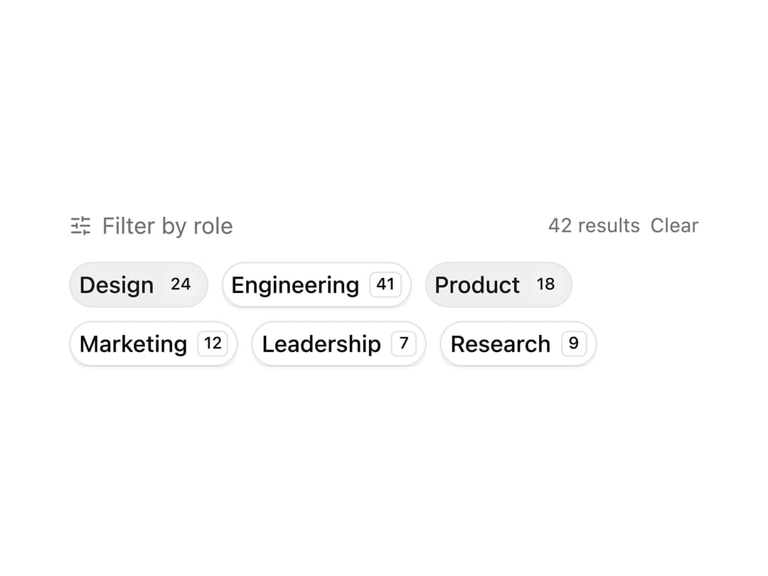
Role filter chips built from toggle buttons, each with a count badge and a live running total of matching results.
Built with React and Tailwind. Copy the prompt and paste it into Claude Code, Cursor or Lovable: your agent adds Role Filter Chips to your project and fits it to your theme.
Code
How Role Filter Chips is used: the demo's code. The component's own source comes with a free account.
Usage.tsx
"use client";

import { SlidersHorizontalIcon } from "lucide-react";
import { useState } from "react";

import { Badge } from "@/components/ui/v-toggle-10-utils/badge";
import { Toggle } from "@/components/ui/v-toggle-10-utils/toggle";

const filters = [
  { count: 24, id: "design", label: "Design" },
  { count: 41, id: "engineering", label: "Engineering" },
  { count: 18, id: "product", label: "Product" },
  { count: 12, id: "marketing", label: "Marketing" },
  { count: 7, id: "leadership", label: "Leadership" },
  { count: 9, id: "research", label: "Research" },
];

function Pattern() {
  const [active, setActive] = useState<Set<string>>(
    new Set(["design", "product"]),
  );

  const toggle = (id: string) =>
    setActive((prev) => {
      const next = new Set(prev);
      next.has(id) ? next.delete(id) : next.add(id);
      return next;
    });

  const totalResults =
    active.size === 0
      ? filters.reduce((sum, f) => sum + f.count, 0)
      : filters
          .filter((f) => active.has(f.id))
          .reduce((sum, f) => sum + f.count, 0);

  return (
    <div className="w-full max-w-sm space-y-3">
      <div className="flex items-center justify-between">
        <div className="flex items-center gap-1.5 text-muted-foreground text-sm">
          <SlidersHorizontalIcon className="size-3.5" />
          <span>Filter by role</span>
        </div>
        <div className="flex items-center gap-1.5">
          <span className="text-muted-foreground text-xs">
            {totalResults} results
          </span>
          {active.size > 0 && (
            <button
              className="text-muted-foreground text-xs underline-offset-2 hover:text-foreground hover:underline"
              onClick={() => setActive(new Set())}
              type="button"
            >
              Clear
            </button>
          )}
        </div>
      </div>

      <div className="flex flex-wrap gap-2">
        {filters.map((filter) => {
          const isActive = active.has(filter.id);
          return (
            <Toggle
              aria-label={`Filter by ${filter.label}`}
              className="gap-1.5 rounded-full"
              key={filter.id}
              onPressedChange={() => toggle(filter.id)}
              pressed={isActive}
              size="sm"
              variant="outline"
            >
              {filter.label}
              <Badge
                className={`transition-colors ${isActive ? "bg-primary-foreground/20 text-current" : ""}`}
                size="sm"
                variant={isActive ? "default" : "outline"}
              >
                {filter.count}
              </Badge>
            </Toggle>
          );
        })}
      </div>
    </div>
  );
}

export default function Default() {
  return (
    <div className="flex min-h-[380px] w-full items-center justify-center p-6">
      <Pattern />
    </div>
  );
}
Dependencies
More by Cnippet
View all

Team
1.3K
Davincho Hero-1
683
Aero Hero-3
558
Features
510
Random Letter Swap Navigation
487
Services with Animated Hover Modal
465
Blogs
396
Aero Hero-1
356