
About
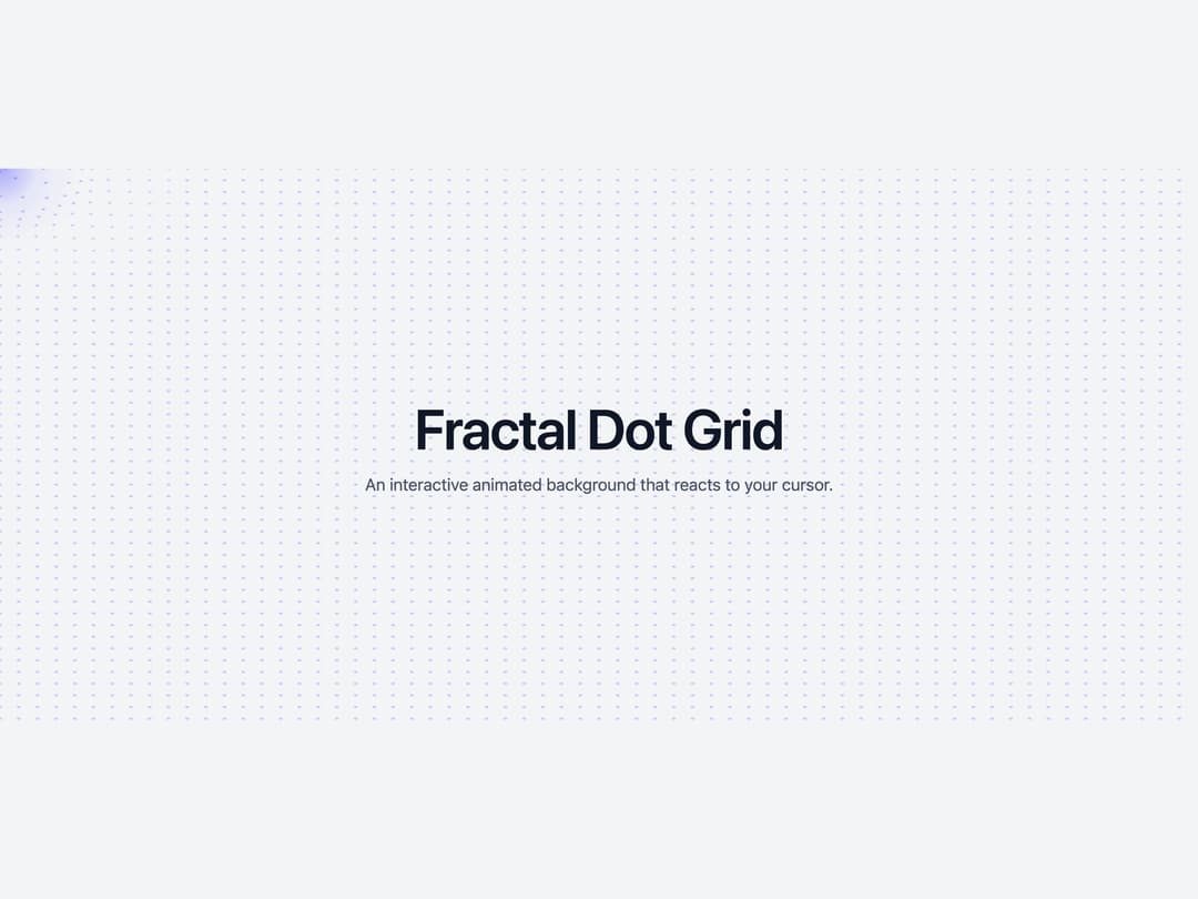
An interactive full-screen canvas background of animated dots that ripple in a wave around the cursor, with configurable size, spacing, color, glow and noise effects.
Built with React and Tailwind. Copy the prompt and paste it into Claude Code, Cursor or Lovable: your agent adds Animated Fractal Dot Grid to your project and fits it to your theme.
Code
How Animated Fractal Dot Grid is used: the demo's code. The component's own source comes with a free account.
Usage.tsx
"use client";

import React from "react";

import { FractalDotGrid } from "@/components/ui/bg-animated-fractal-dot-grid";

export default function FractalDotGridDemo() {
  return (
    <div className="relative flex h-[600px] w-full items-center justify-center overflow-hidden bg-gray-100">
      <FractalDotGrid
        dotSize={4}
        dotSpacing={20}
        dotOpacity={0.3}
        waveIntensity={30}
        waveRadius={200}
        dotColor="rgba(100, 100, 255, 1)"
        glowColor="rgba(100, 100, 255, 1)"
        enableNoise={true}
        noiseOpacity={0.03}
        enableMouseGlow={true}
        initialPerformance="high"
      />
      <div className="relative z-10 px-6 text-center">
        <h1 className="text-4xl font-semibold tracking-tight text-gray-900 sm:text-6xl">
          Fractal Dot Grid
        </h1>
        <p className="mt-4 text-base text-gray-600 sm:text-lg">
          An interactive animated background that reacts to your cursor.
        </p>
      </div>
    </div>
  );
}
Dependencies
More by cult/ui
View all
3D Carousel
2.5K
Logo Carousel
1.1K
Feature Carousel
503
Popover Form
419
Floating Panel
245
Expandable
126
Dock
119
Hero Liquid Metal
100