
About
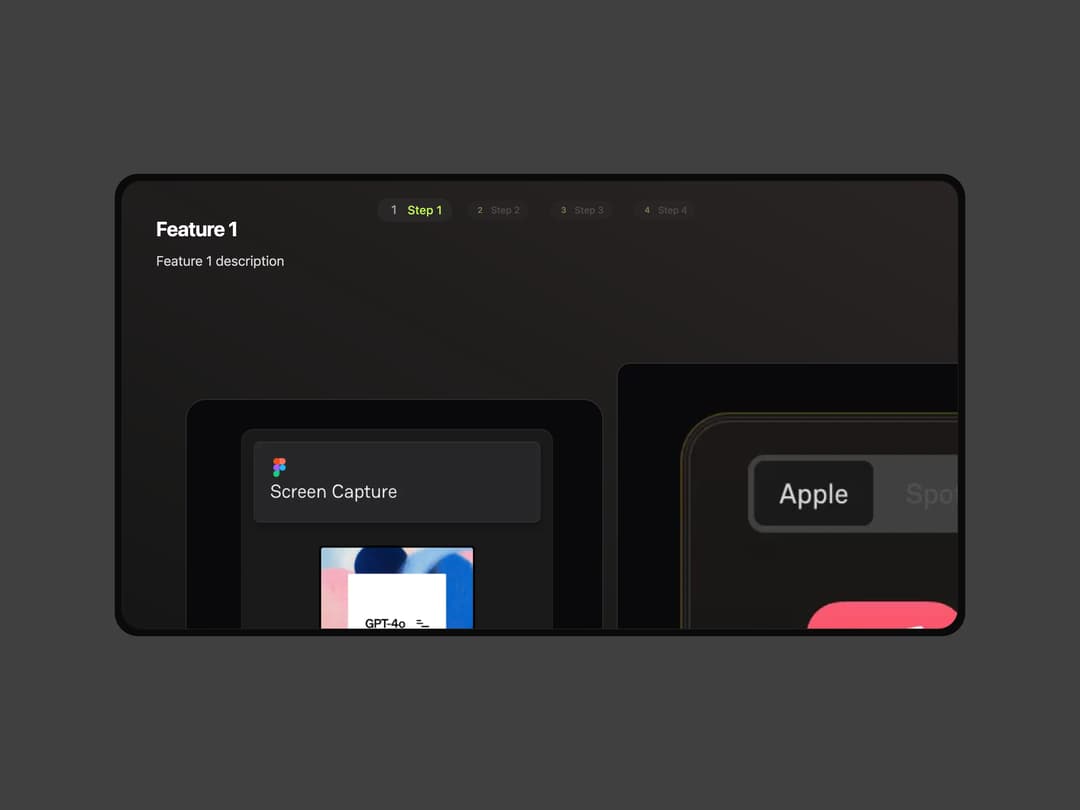
Here is modern feature carousel component
Built with React and Tailwind. Copy the prompt and paste it into Claude Code, Cursor or Lovable: your agent adds Feature Carousel to your project and fits it to your theme.
Code
How Feature Carousel is used: the demo's code. The component's own source comes with a free account.
Usage.tsx
"use client"

import { cn } from "@/lib/utils"
import { Component } from "@/components/ui/feature-carousel"

const FeatureCarouselDemo = () => {
  return (
    <div className="w-full max-w-5xl mx-auto">
      <div className="rounded-[34px] bg-neutral-700 p-2">
        <div className="relative z-10 grid w-full gap-8 rounded-[28px] bg-neutral-950 p-2">
          <Component
            title="Interactive Feature Demo"
            description="Showcase your features with smooth animations and transitions"
            step1img1Class={cn(
              "pointer-events-none w-[50%] border border-stone-100/10 transition-all duration-500 dark:border-stone-700/50",
              "max-md:scale-[160%] max-md:rounded-[24px] rounded-[24px] left-[25%] top-[57%] md:left-[35px] md:top-[29%]",
              "md:group-hover:translate-y-2"
            )}
            step1img2Class={cn(
              "pointer-events-none w-[60%] border border-stone-100/10 dark:border-stone-700/50 transition-all duration-500 overflow-hidden",
              "max-md:scale-[160%] rounded-2xl max-md:rounded-[24px] left-[69%] top-[53%] md:top-[21%] md:left-[calc(50%+35px+1rem)]",
              "md:group-hover:-translate-y-6"
            )}
            step2img1Class={cn(
              "pointer-events-none w-[50%] rounded-t-[24px] overflow-hidden border border-stone-100/10 transition-all duration-500 dark:border-stone-700",
              "max-md:scale-[160%] left-[25%] top-[69%] md:left-[35px] md:top-[30%]",
              "md:group-hover:translate-y-2"
            )}
            step2img2Class={cn(
              "pointer-events-none w-[40%] rounded-t-[24px] border border-stone-100/10 dark:border-stone-700 transition-all duration-500 rounded-2xl overflow-hidden",
              "max-md:scale-[140%] left-[70%] top-[53%] md:top-[25%] md:left-[calc(50%+27px+1rem)]",
              "md:group-hover:-translate-y-6"
            )}
            step3imgClass={cn(
              "pointer-events-none w-[90%] border border-stone-100/10 dark:border-stone-700 rounded-t-[24px] transition-all duration-500 overflow-hidden",
              "left-[5%] top-[50%] md:top-[30%] md:left-[68px]"
            )}
            step4imgClass={cn(
              "pointer-events-none w-[90%] border border-stone-100/10 dark:border-stone-700 rounded-t-[24px] transition-all duration-500 overflow-hidden",
              "left-[5%] top-[50%] md:top-[30%] md:left-[68px]"
            )}
            image={{
              step1light1: "https://www.cult-ui.com/_next/image?url=%2Ffeature-1.png&w=3840&q=75",
              step1light2: "https://www.cult-ui.com/_next/image?url=%2Ffeature-2.png&w=3840&q=75",
              step2light1: "https://www.cult-ui.com/_next/image?url=%2Ffeature-3.png&w=3840&q=75",
              step2light2: "https://www.cult-ui.com/_next/image?url=%2Ffeature-4.png&w=3840&q=75",
              step3light: "https://www.cult-ui.com/_next/image?url=%2Ffeature-2.png&w=3840&q=75",
              step4light: "https://www.cult-ui.com/_next/image?url=%2F_next%2Fstatic%2Fmedia%2Fcults.561bd752.png&w=3840&q=75",
              alt: "Feature demonstration",
            }}
            bgClass="bg-gradient-to-tr from-neutral-900/90 to-neutral-800/90"
          />
        </div>
      </div>
    </div>
  )
}

export default FeatureCarouselDemo
Dependencies
More by cult/ui
View all
3D Carousel
2.5K
Logo Carousel
1.1K
Popover Form
419
Floating Panel
245
Expandable
126
Dock
119
Hero Liquid Metal
100
Hero Color Panel
95
More in Features
View all

Features 8
3K
Features 2
322

Grid Feature Cards
1.9K

Feature Sections
52
Feature Modern
17
Feature with advantages
278
Feature Section with card gradient
169
Features 4
368


