
About
Color picker
Built with React and Tailwind. Copy the prompt and paste it into Claude Code, Cursor or Lovable: your agent adds Color Picker to your project and fits it to your theme.
Code
How Color Picker is used: the demo's code. The component's own source comes with a free account.
Usage.tsx
"use client"

import React, { useState } from "react"
import { motion } from "framer-motion"

import { CardContent } from "@/components/ui/card"

import { ColorPicker } from "@/components/ui/color-picker"

export function ColorPickerDemo() {
  const [color, setColor] = useState("240 5.9% 10%")

  return (
    <div className="w-full max-w-4xl mx-auto overflow-y-auto">
      <CardContent className="p-6 space-y-6">
        <div className="grid md:grid-cols-1 gap-6">
          <div className="space-y-4">
            <div className="relative">
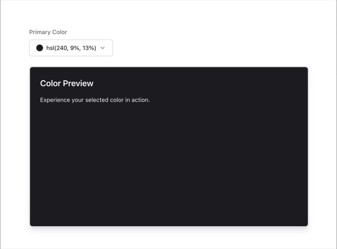
              <label className="text-sm font-medium text-muted-foreground mb-2 block">
                Primary Color
              </label>
              <div className="flex items-center">
                <ColorPicker
                  color={`hsl(${color})`}
                  onChange={(newColor) => {
                    const [h, s, l] = newColor
                      .match(/\d+(\.\d+)?/g)
                      ?.map(Number) || [0, 0, 0]
                    setColor(`${h.toFixed(1)} ${s.toFixed(1)}% ${l.toFixed(1)}%`)
                  }}
                />
              </div>
            </div>
          </div>

          <motion.div
            className="w-full h-full min-h-[24rem] rounded-lg p-6 shadow-lg transition-colors duration-300 ease-in-out overflow-hidden"
            style={{
              backgroundColor: `hsl(${color})`,
              color: `hsl(0 0% 100%)`,
              borderWidth: 2,
              borderStyle: "solid",
            }}
            initial={{ opacity: 0, y: 20 }}
            animate={{ opacity: 1, y: 0 }}
            transition={{ duration: 0.5 }}
          >
            <h3 className="text-xl font-semibold mb-4">Color Preview</h3>
            <p className="text-sm mb-4">
              Experience your selected color in action.
            </p>
          </motion.div>
        </div>
      </CardContent>
    </div>
  )
}
Dependencies
More by cult/ui
View all
3D Carousel
2.5K
Logo Carousel
1.1K
Feature Carousel
504
Popover Form
419
Floating Panel
245
Expandable
126
Dock
119
Hero Liquid Metal
101