
About
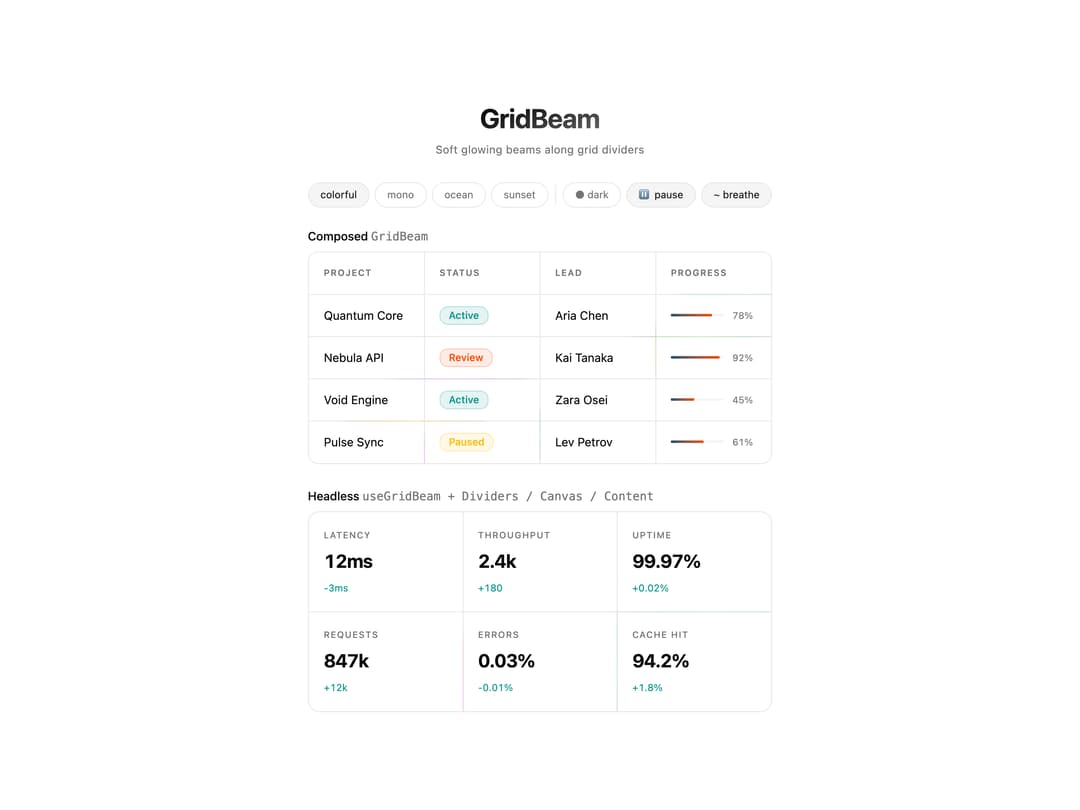
Animated canvas background that sends soft glowing light beams along grid dividers, with color palette presets and composable headless pieces.
Built with React and Tailwind. Copy the prompt and paste it into Claude Code, Cursor or Lovable: your agent adds Grid Beam to your project and fits it to your theme.
Code
How Grid Beam is used: the demo's code. The component's own source comes with a free account.
Usage.tsx
"use client";

import {
  GridBeam,
  GridBeamCanvas,
  GridBeamContent,
  GridBeamDividers,
  useGridBeam,
  type GridBeamPaletteKey,
} from "@/components/ui/grid-beam";
import { useEffect, useState } from "react";
import { useTheme } from "next-themes";

import { cn } from "@/lib/utils";

const DEMO_DATA = [
  ["Project", "Status", "Lead", "Progress"],
  ["Quantum Core", "Active", "Aria Chen", "78%"],
  ["Nebula API", "Review", "Kai Tanaka", "92%"],
  ["Void Engine", "Active", "Zara Osei", "45%"],
  ["Pulse Sync", "Paused", "Lev Petrov", "61%"],
] as const;

/** Status → shadcn chart tokens (light & dark follow `globals.css` variables). */
const STATUS_BADGE_CLASS: Record<string, string> = {
  Active: "border border-chart-2/25 bg-chart-2/10 text-chart-2",
  Review: "border border-chart-1/25 bg-chart-1/10 text-chart-1",
  Paused: "border border-chart-4/25 bg-chart-4/10 text-chart-4",
};

const PROGRESS_FILL: Record<GridBeamPaletteKey, string> = {
  colorful: "linear-gradient(90deg, var(--chart-3), var(--chart-1))",
  ocean: "linear-gradient(90deg, var(--chart-2), var(--chart-1))",
  sunset: "linear-gradient(90deg, var(--chart-4), var(--chart-5))",
  mono: "linear-gradient(90deg, var(--muted-foreground), var(--foreground))",
};

const VARIANTS: GridBeamPaletteKey[] = ["colorful", "mono", "ocean", "sunset"];

function pillClass(active: boolean) {
  return cn(
    "cursor-pointer rounded-full border border-border px-3.5 py-1.5 font-inherit text-xs transition-colors",
    active
      ? "bg-accent text-accent-foreground"
      : "bg-transparent text-muted-foreground fine-hover:hover:bg-muted/60",
  );
}

function beamThemeFromResolved(resolved: string | undefined): "dark" | "light" {
  return resolved === "dark" ? "dark" : "light";
}

/** Headless API: compose layers yourself (same animation as {@link GridBeam}). */
function HeadlessMetricsStrip({
  variant,
  beamTheme,
  active,
  breathe,
}: {
  variant: GridBeamPaletteKey;
  beamTheme: "dark" | "light";
  active: boolean;
  breathe: boolean;
}) {
  const { canvasRef, rows, cols } = useGridBeam({
    rows: 2,
    cols: 3,
    colorVariant: variant,
    theme: beamTheme,
    active,
    breathe,
    duration: 4.2,
    strength: 0.85,
  });

  return (
    <div className="relative overflow-hidden rounded-xl border border-border bg-card/40">
      <GridBeamDividers cols={cols} rows={rows} />
      <GridBeamCanvas borderRadius={12} ref={canvasRef} />
      <GridBeamContent>
        <div
          className="grid h-full"
          style={{
            gridTemplateColumns: "repeat(3, 1fr)",
            gridTemplateRows: "repeat(2, 1fr)",
          }}
        >
          {[
            { label: "Latency", value: "12ms", delta: "-3ms" },
            { label: "Throughput", value: "2.4k", delta: "+180" },
            { label: "Uptime", value: "99.97%", delta: "+0.02%" },
            { label: "Requests", value: "847k", delta: "+12k" },
            { label: "Errors", value: "0.03%", delta: "-0.01%" },
            { label: "Cache Hit", value: "94.2%", delta: "+1.8%" },
          ].map((item) => (
            <div
              className="flex flex-col gap-1.5 px-[18px] py-5"
              key={item.label}
            >
              <span className="font-medium text-[10.5px] text-muted-foreground uppercase tracking-widest">
                {item.label}
              </span>
              <span className="font-bold text-[22px] text-foreground tabular-nums tracking-tight">
                {item.value}
              </span>
              <span className="text-[11.5px] text-chart-2 tabular-nums">
                {item.delta}
              </span>
            </div>
          ))}
        </div>
      </GridBeamContent>
    </div>
  );
}

function DemoTableCell({
  cell,
  isProgress,
  isStatus,
  progressFill,
  statusClass,
}: {
  cell: string;
  isProgress: boolean;
  isStatus: boolean;
  progressFill: string;
  statusClass: string | undefined;
}) {
  if (isStatus && statusClass) {
    return (
      <span
        className={cn(
          "rounded-lg px-2.5 py-0.5 font-medium text-xs",
          statusClass,
        )}
      >
        {cell}
      </span>
    );
  }
  if (isProgress) {
    return (
      <div className="flex w-full items-center gap-2.5">
        <div className="h-[3px] flex-1 overflow-hidden rounded-sm bg-muted">
          <div
            className="h-full rounded-sm"
            style={{
              width: cell,
              background: progressFill,
            }}
          />
        </div>
        <span className="min-w-[28px] text-[11px] text-muted-foreground tabular-nums">
          {cell}
        </span>
      </div>
    );
  }
  return cell;
}

export default function GridBeamDemo() {
  const [variant, setVariant] = useState<GridBeamPaletteKey>("colorful");
  const [isActive, setIsActive] = useState(true);
  const [breathe, setBreathe] = useState(true);

  const { resolvedTheme, setTheme } = useTheme();
  const [mounted, setMounted] = useState(false);

  useEffect(() => {
    setMounted(true);
  }, []);

  const beamTheme = beamThemeFromResolved(resolvedTheme);
  const progressFill =
    PROGRESS_FILL[variant] ??
    "linear-gradient(90deg, var(--muted-foreground), var(--foreground))";

  return (
    <main className="flex min-h-screen flex-col items-center justify-center bg-background px-5 py-10 font-sans text-foreground transition-colors">
      <h1 className="mb-1 bg-gradient-to-br from-20% from-foreground to-muted-foreground bg-clip-text font-bold text-[clamp(22px,3.5vw,32px)] text-transparent tracking-tight">
        GridBeam
      </h1>
      <p className="mb-7 text-[13px] text-muted-foreground tracking-wide">
        Soft glowing beams along grid dividers
      </p>

      <div className="mb-6 flex flex-wrap items-center justify-center gap-1.5">
        {VARIANTS.map((v) => (
          <button
            className={pillClass(variant === v)}
            key={v}
            onClick={() => setVariant(v)}
            type="button"
          >
            {v}
          </button>
        ))}
        <span aria-hidden className="mx-0.5 h-6 w-px bg-border" />
        <button
          className={pillClass(false)}
          disabled={!mounted}
          onClick={() => setTheme(resolvedTheme === "dark" ? "light" : "dark")}
          type="button"
        >
          {mounted && resolvedTheme === "dark" ? "☀ light" : "● dark"}
        </button>
        <button
          className={pillClass(isActive)}
          onClick={() => setIsActive(!isActive)}
          type="button"
        >
          {isActive ? "⏸ pause" : "▶ play"}
        </button>
        <button
          className={pillClass(breathe)}
          onClick={() => setBreathe(!breathe)}
          type="button"
        >
          {breathe ? "~ breathe" : "— static"}
        </button>
      </div>

      <div className="w-full max-w-[660px] space-y-7">
        <section className="space-y-2">
          <h2 className="font-medium text-foreground text-sm">
            Composed <code className="text-muted-foreground">GridBeam</code>
          </h2>
          <GridBeam
            active={isActive}
            borderRadius={12}
            breathe={breathe}
            className="border border-border bg-card/40"
            colorVariant={variant}
            cols={DEMO_DATA[0].length}
            duration={3.4}
            rows={DEMO_DATA.length}
            strength={1}
            theme={beamTheme}
          >
            <div
              className="grid h-full"
              style={{
                gridTemplateColumns: `repeat(${DEMO_DATA[0].length}, 1fr)`,
                gridTemplateRows: `repeat(${DEMO_DATA.length}, 1fr)`,
              }}
            >
              {DEMO_DATA.flat().map((cell, i) => {
                const row = Math.floor(i / DEMO_DATA[0].length);
                const col = i % DEMO_DATA[0].length;
                const isHeader = row === 0;
                const isStatus = col === 1 && !isHeader;
                const isProgress = col === 3 && !isHeader;
                const statusClass = isStatus
                  ? STATUS_BADGE_CLASS[cell]
                  : undefined;
                return (
                  <div
                    className={cn(
                      "flex items-center px-[18px] py-3.5",
                      isHeader
                        ? "font-semibold text-[10.5px] text-muted-foreground uppercase tracking-widest"
                        : "text-sm",
                    )}
                    key={`${row}-${col}-${cell}`}
                  >
                    <DemoTableCell
                      cell={cell}
                      isProgress={isProgress}
                      isStatus={isStatus}
                      progressFill={progressFill}
                      statusClass={statusClass}
                    />
                  </div>
                );
              })}
            </div>
          </GridBeam>
        </section>

        <section className="space-y-2">
          <h2 className="font-medium text-foreground text-sm">
            Headless{" "}
            <code className="text-muted-foreground">
              useGridBeam + Dividers / Canvas / Content
            </code>
          </h2>
          <HeadlessMetricsStrip
            active={isActive}
            beamTheme={beamTheme}
            breathe={breathe}
            variant={variant}
          />
        </section>
      </div>
    </main>
  );
}
Dependencies
More by cult/ui
View all
3D Carousel
2.5K
Logo Carousel
1.1K
Feature Carousel
503
Popover Form
419
Floating Panel
245
Expandable
126
Dock
119
Hero Liquid Metal
100