
About
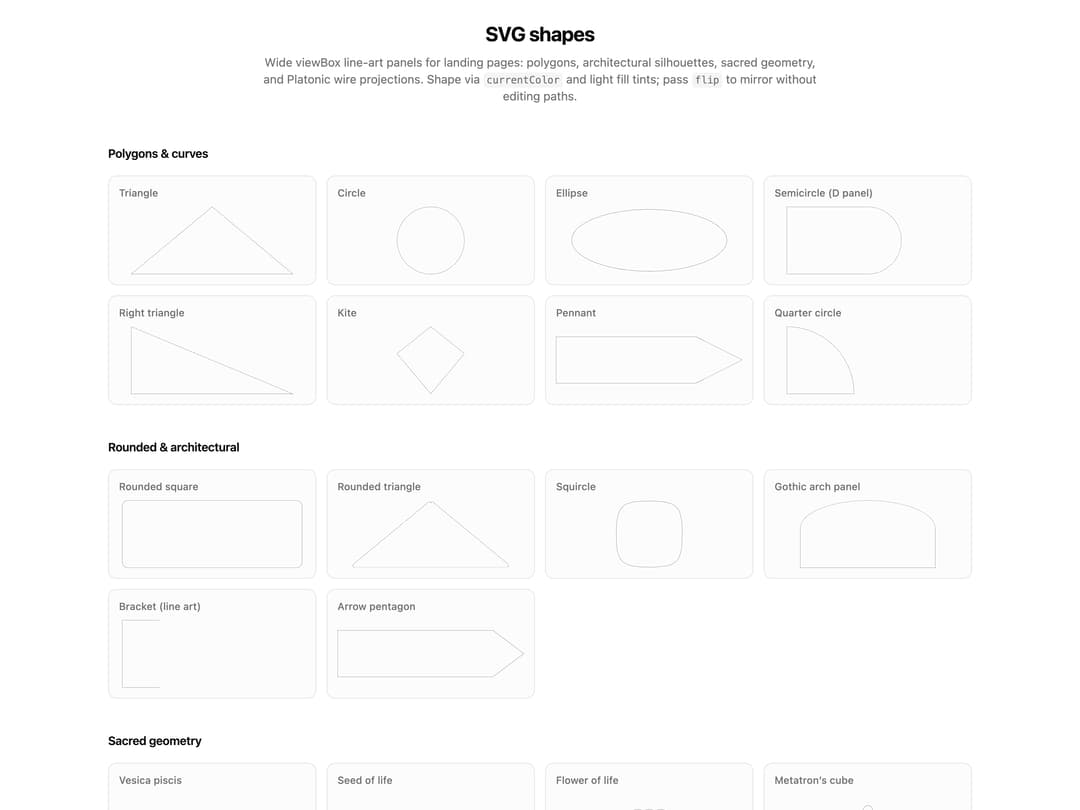
A library of wide-viewBox line-art SVG shape components (polygons, architectural panels, sacred-geometry diagrams, and Platonic-solid wireframes) for hero sections and landing-page background decoration.
Built with React and Tailwind. Copy the prompt and paste it into Claude Code, Cursor or Lovable: your agent adds SVG Shapes to your project and fits it to your theme.
Code
How SVG Shapes is used: the demo's code. The component's own source comes with a free account.
Usage.tsx
"use client";

import type { ReactNode } from "react";

import {
  ArrowPentagonShapeSvg,
  CircleShapeSvg,
  CubeWireshapeSvg,
  DodecahedronWireshapeSvg,
  EllipseShapeSvg,
  FlowerOfLifeSvg,
  GoldenSpiralSvg,
  GothicArchPanelSvg,
  IcosahedronWireshapeSvg,
  KiteShapeSvg,
  MetatronsCubeSvg,
  OctahedronWireshapeSvg,
  PennantShapeSvg,
  QuarterCircleShapeSvg,
  RightTriangleShapeSvg,
  RoundedSquareShapeSvg,
  RoundedTriangleShapeSvg,
  SeedOfLifeSvg,
  SemicircleShapeSvg,
  SingleBracketShapeSvg,
  SquircleShapeSvg,
  SriYantraSvg,
  TetrahedronWireshapeSvg,
  TorusTubeSvg,
  TriangleShapeSvg,
  VesicaPiscisSvg,
} from "@/components/ui/svg-shapes";

function DemoSection({
  title,
  children,
}: {
  title: string;
  children: ReactNode;
}) {
  return (
    <section className="w-full space-y-4">
      <h3 className="text-foreground text-sm font-semibold tracking-tight">
        {title}
      </h3>
      <div className="grid grid-cols-2 gap-3 sm:grid-cols-3 md:grid-cols-4">
        {children}
      </div>
    </section>
  );
}

function ShapeTile({
  label,
  tall,
  children,
}: {
  label: string;
  tall?: boolean;
  children: ReactNode;
}) {
  return (
    <div className="bg-muted/30 flex flex-col gap-2 rounded-lg border p-3">
      <p className="text-muted-foreground text-xs font-medium">{label}</p>
      <div
        className={`flex items-center justify-center [&_svg]:w-full ${
          tall ? "min-h-28 [&_svg]:max-h-28" : "min-h-20 [&_svg]:max-h-20"
        }`}
      >
        {children}
      </div>
    </div>
  );
}

export default function SvgShapesDemo() {
  return (
    <div className="dark:bg-stone-950 flex flex-col items-center gap-12 rounded-md px-4 py-6 md:px-0">
      <div className="max-w-2xl space-y-2 text-center">
        <h2 className="text-foreground text-2xl font-bold tracking-tight">
          SVG shapes
        </h2>
        <p className="text-muted-foreground text-sm">
          Wide viewBox line-art panels for landing pages: polygons,
          architectural silhouettes, sacred geometry, and Platonic wire
          projections. Shape via{" "}
          <code className="bg-muted rounded px-1 py-0.5 text-xs">
            currentColor
          </code>{" "}
          and light fill tints; pass{" "}
          <code className="bg-muted rounded px-1 py-0.5 text-xs">flip</code> to
          mirror without editing paths.
        </p>
      </div>

      <div className="flex w-full max-w-5xl flex-col gap-10">
        <DemoSection title="Polygons & curves">
          <ShapeTile label="Triangle">
            <TriangleShapeSvg />
          </ShapeTile>
          <ShapeTile label="Circle">
            <CircleShapeSvg />
          </ShapeTile>
          <ShapeTile label="Ellipse">
            <EllipseShapeSvg />
          </ShapeTile>
          <ShapeTile label="Semicircle (D panel)">
            <SemicircleShapeSvg />
          </ShapeTile>
          <ShapeTile label="Right triangle">
            <RightTriangleShapeSvg />
          </ShapeTile>
          <ShapeTile label="Kite">
            <KiteShapeSvg />
          </ShapeTile>
          <ShapeTile label="Pennant">
            <PennantShapeSvg />
          </ShapeTile>
          <ShapeTile label="Quarter circle">
            <QuarterCircleShapeSvg />
          </ShapeTile>
        </DemoSection>

        <DemoSection title="Rounded & architectural">
          <ShapeTile label="Rounded square">
            <RoundedSquareShapeSvg />
          </ShapeTile>
          <ShapeTile label="Rounded triangle">
            <RoundedTriangleShapeSvg />
          </ShapeTile>
          <ShapeTile label="Squircle">
            <SquircleShapeSvg />
          </ShapeTile>
          <ShapeTile label="Gothic arch panel">
            <GothicArchPanelSvg />
          </ShapeTile>
          <ShapeTile label="Bracket (line art)">
            <SingleBracketShapeSvg />
          </ShapeTile>
          <ShapeTile label="Arrow pentagon">
            <ArrowPentagonShapeSvg />
          </ShapeTile>
        </DemoSection>

        <DemoSection title="Sacred geometry">
          <ShapeTile label="Vesica piscis" tall>
            <VesicaPiscisSvg />
          </ShapeTile>
          <ShapeTile label="Seed of life" tall>
            <SeedOfLifeSvg />
          </ShapeTile>
          <ShapeTile label="Flower of life" tall>
            <FlowerOfLifeSvg />
          </ShapeTile>
          <ShapeTile label="Metatron’s cube" tall>
            <MetatronsCubeSvg />
          </ShapeTile>
          <ShapeTile label="Sri Yantra" tall>
            <SriYantraSvg />
          </ShapeTile>
          <ShapeTile label="Golden spiral" tall>
            <GoldenSpiralSvg />
          </ShapeTile>
          <ShapeTile label="Torus tube" tall>
            <TorusTubeSvg />
          </ShapeTile>
        </DemoSection>

        <DemoSection title="Platonic solids (wire projections)">
          <ShapeTile label="Tetrahedron">
            <TetrahedronWireshapeSvg />
          </ShapeTile>
          <ShapeTile label="Cube">
            <CubeWireshapeSvg />
          </ShapeTile>
          <ShapeTile label="Octahedron">
            <OctahedronWireshapeSvg />
          </ShapeTile>
          <ShapeTile label="Icosahedron">
            <IcosahedronWireshapeSvg />
          </ShapeTile>
          <ShapeTile label="Dodecahedron">
            <DodecahedronWireshapeSvg />
          </ShapeTile>
        </DemoSection>

        <section className="w-full space-y-4">
          <h3 className="text-foreground text-sm font-semibold tracking-tight">
            Flip prop
          </h3>
          <div className="grid grid-cols-2 gap-3 sm:grid-cols-4">
            {(
              [
                ["none", "none"],
                ["vertical", "vertical"],
                ["horizontal", "horizontal"],
                ["both axes", "both"],
              ] as const
            ).map(([label, flip]) => (
              <ShapeTile key={flip} label={label}>
                <PennantShapeSvg flip={flip} />
              </ShapeTile>
            ))}
          </div>
        </section>
      </div>
    </div>
  );
}
More by cult/ui
View all
3D Carousel
2.5K
Logo Carousel
1.1K
Feature Carousel
504
Popover Form
419
Floating Panel
245
Expandable
126
Dock
119
Hero Liquid Metal
101
More in Heroes
View all

SaaS Template
2.4K
Centered Hero with Image Fan
930

Hero
1.2K

Responsive Hero Banner
2K

Minimalist Hero Fashion
285

Hero Section 6
881

Home Section
66
Hero Golden Spiral
101
