
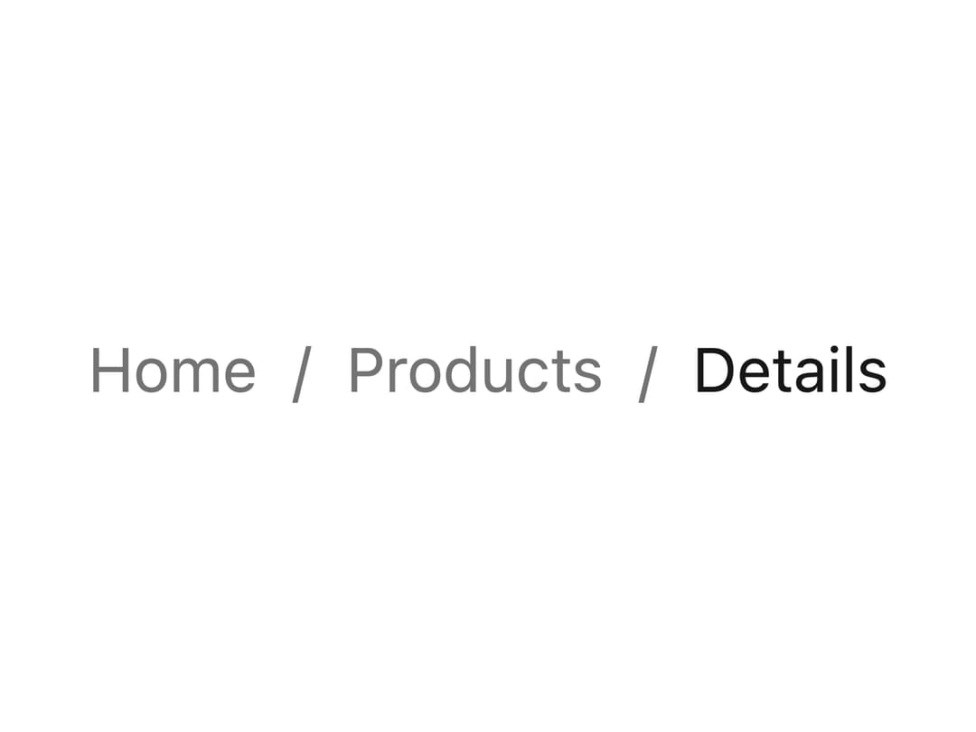
About
A navigation component that shows the current page's location as a trail of links separated by a customizable separator, with slot-level styling for the list, items and separator.
Built with React and Tailwind. Copy the prompt and paste it into Claude Code, Cursor or Lovable: your agent adds Breadcrumbs to your project and fits it to your theme.
Code
How Breadcrumbs is used: the demo's code. The component's own source comes with a free account.
Usage.tsx
import Breadcrumbs from "@/components/ui/breadcrumbs";

export default function BreadcrumbsSlotCustomizationDemo() {
  return (
    <Breadcrumbs
      aria-label="Breadcrumb"
      className="text-sm"
      seperator="›"
      slotProps={{
        ol: {
          className: "flex items-center gap-2.5",
        },
        li: {
          className: "text-gray-600 dark:text-gray-300",
        },
        seperator: {
          className: "text-gray-400 dark:text-gray-500 text-lg",
        },
      }}
    >
      <a
        className="py-1 px-2 rounded-sm bg-neutral-200 text-neutral-900 dark:bg-neutral-800 dark:text-white"
        href="/"
      >
        Home
      </a>
      <a
        className="py-1 px-2 rounded-sm bg-neutral-200 text-neutral-900 dark:bg-neutral-800 dark:text-white"
        href="/products"
      >
        Products
      </a>
      <span className="text-neutral-900 dark:text-neutral-50">Details</span>
    </Breadcrumbs>
  );
}
Dependencies
More by darshan-rajadhyaksha
View all
Backdrop
1
Card Content

Checkbox
Textarea
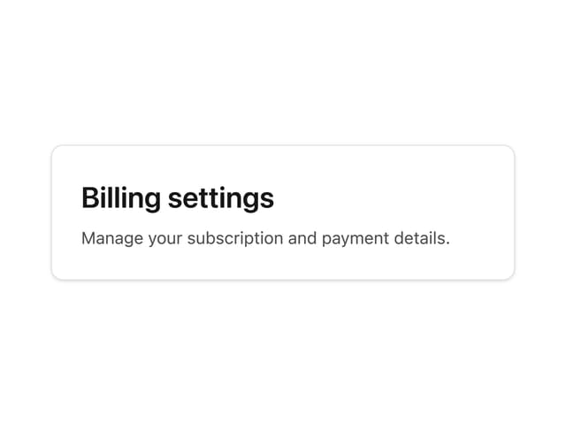
Card Title
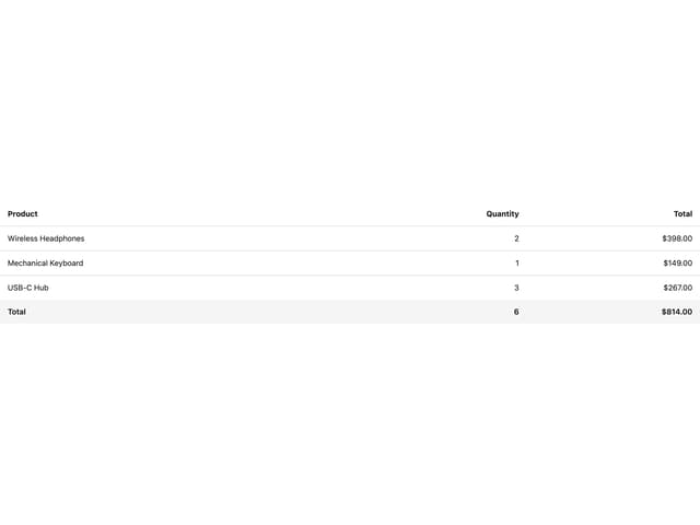
Table
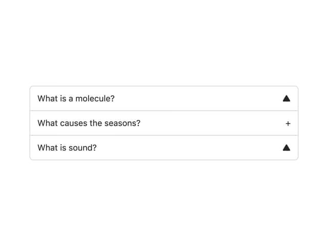
Accordion
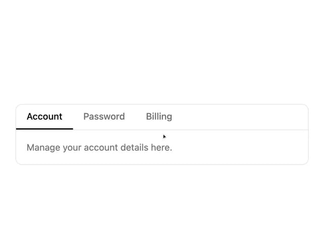
Tabs Context
More in Navigation
View all

Sidebar
235
Navbar with Theme Toggle
43

Sidebar
339

Tabs
60
Numberless Pagination with Text
11
Oversized 404 Numeral
50
Footer
446
Pagination
43


