
About
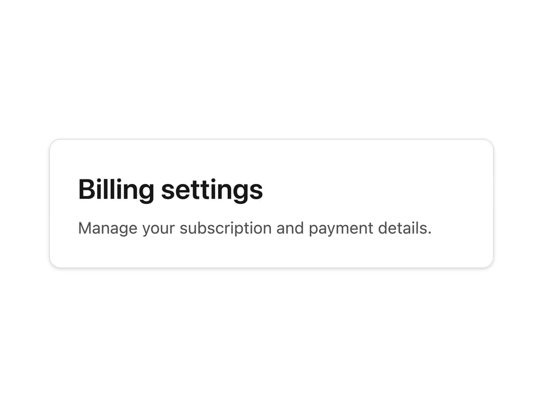
A styled heading element used inside a card header to display the card's primary title, ported from RockSolid UI (SolidJS) to React, by Darshan Rajadhyaksha.
Built with React and Tailwind. Copy the prompt and paste it into Claude Code, Cursor or Lovable: your agent adds Card Title to your project and fits it to your theme.
Code
How Card Title is used: the demo's code. The component's own source comes with a free account.
Usage.tsx
import CardTitle from "@/components/ui/card-title";

export default function CardTitleHeadingLevelDemo() {
  return (
    <div className="w-full max-w-sm rounded-lg border border-neutral-200 bg-white p-6 shadow-sm dark:border-neutral-800 dark:bg-neutral-950">
      <CardTitle as="h3" variant="h4">
        Billing settings
      </CardTitle>
      <p className="mt-1.5 text-sm text-neutral-600 dark:text-neutral-300">
        Manage your subscription and payment details.
      </p>
    </div>
  );
}
Dependencies
More by darshan-rajadhyaksha
View all
Backdrop
1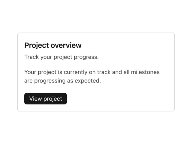
Card Content
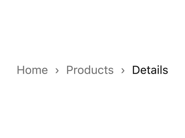
Breadcrumbs

Checkbox
Textarea
Table
Accordion
Tabs Context
More in Cards
View all
Stats cards with links
33

Course Design Cards
1.1K

Card
70
Statistics Card 10
263
Statistics Card 2
264

Card
17

Card Studio
9
File Card Collections
1K

