
About
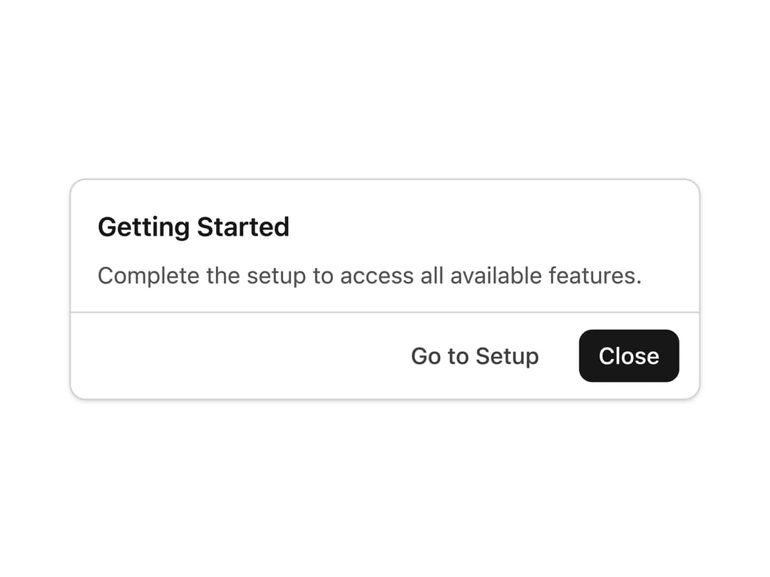
A footer container for a dialog that right-aligns action buttons (like Cancel/Confirm) with a top divider, ported from the RockSolid (SolidJS) UI library to React.
Built with React and Tailwind. Copy the prompt and paste it into Claude Code, Cursor or Lovable: your agent adds Dialog Actions to your project and fits it to your theme.
Code
How Dialog Actions is used: the demo's code. The component's own source comes with a free account.
Usage.tsx
import DialogActions from "@/components/ui/dialog-actions";

export default function DialogActionsDemo() {
  return (
    <div className="flex w-full items-center justify-center p-8">
      <div className="w-full max-w-sm rounded-lg border border-neutral-300 bg-white shadow-sm dark:border-neutral-700 dark:bg-neutral-900">
        <div className="px-4 pt-4 pb-2">
          <h2 className="text-base font-semibold text-neutral-900 dark:text-neutral-100">
            Getting Started
          </h2>
        </div>
        <div className="px-4 pb-3 text-sm text-neutral-600 dark:text-neutral-400">
          Complete the setup to access all available features.
        </div>
        <DialogActions>
          <button className="rounded-md px-3 py-1.5 text-sm font-medium text-neutral-700 hover:bg-neutral-100 dark:text-neutral-300 dark:hover:bg-neutral-800">
            Go to Setup
          </button>
          <button className="rounded-md bg-neutral-900 px-3 py-1.5 text-sm font-medium text-white hover:bg-neutral-800 dark:bg-neutral-100 dark:text-neutral-900 dark:hover:bg-neutral-300">
            Close
          </button>
        </DialogActions>
      </div>
    </div>
  );
}
Dependencies
More by darshan-rajadhyaksha
View all
Backdrop
1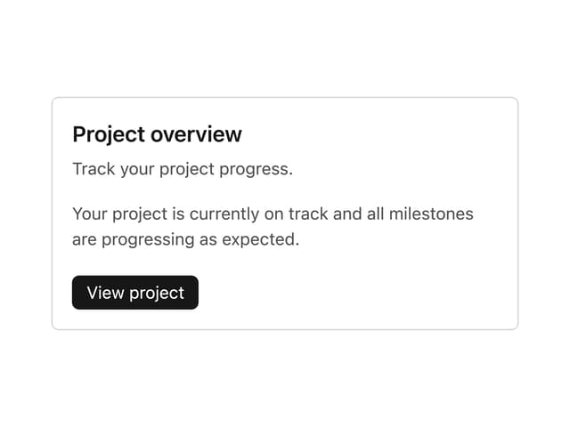
Card Content
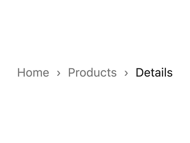
Breadcrumbs

Checkbox
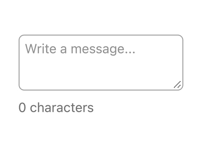
Textarea
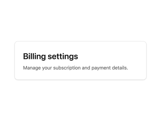
Card Title
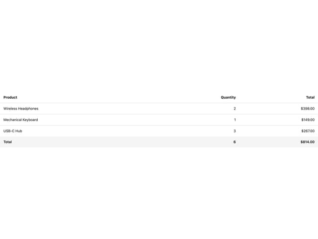
Table
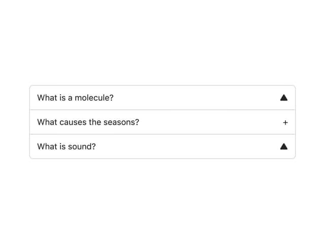
Accordion
More in Buttons
View all
Button Save
46

Button
20

Eclipse Button
5

Button
6

Button
14

Button Group
37

Button
32
Split Button
32

