
About
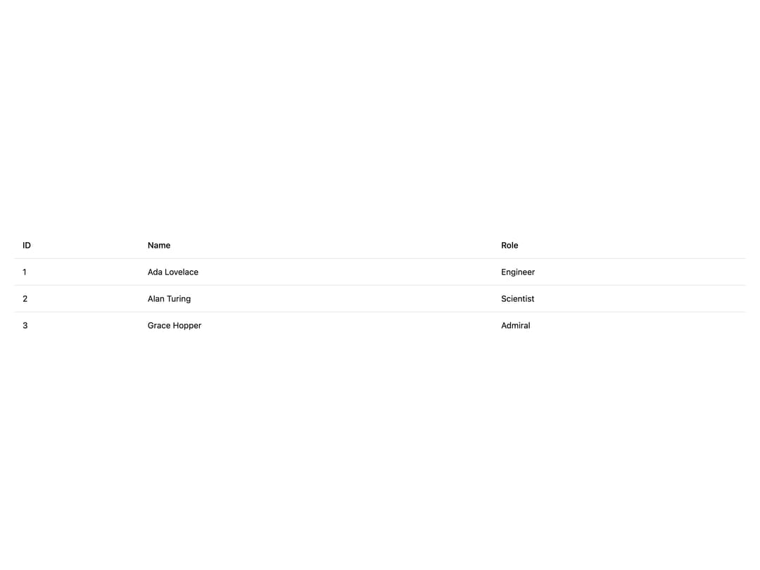
A thead wrapper for a table that marks its descendant cells as header cells via context, so a matching table-cell component can render them as th instead of td.
Built with React and Tailwind. Copy the prompt and paste it into Claude Code, Cursor or Lovable: your agent adds Table Head to your project and fits it to your theme.
Code
How Table Head is used: the demo's code. The component's own source comes with a free account.
Usage.tsx
import TableHead from "@/components/ui/table-head";

const people = [
  { id: 1, name: "Ada Lovelace", role: "Engineer" },
  { id: 2, name: "Alan Turing", role: "Scientist" },
  { id: 3, name: "Grace Hopper", role: "Admiral" },
];

export default function TableHeadDemo() {
  return (
    <div className="w-full p-6">
      <table className="w-full border-collapse text-sm text-left text-foreground">
        <TableHead>
          <tr className="[&_th]:border-b [&_th]:py-3 [&_th]:px-3.5 [&_th]:font-medium [&_th]:text-left">
            <th>ID</th>
            <th>Name</th>
            <th>Role</th>
          </tr>
        </TableHead>
        <tbody>
          {people.map((person, index) => (
            <tr
              key={person.id}
              className={
                index !== people.length - 1
                  ? "[&_td]:border-b [&_td]:py-3 [&_td]:px-3.5"
                  : "[&_td]:py-3 [&_td]:px-3.5"
              }
            >
              <td>{person.id}</td>
              <td>{person.name}</td>
              <td>{person.role}</td>
            </tr>
          ))}
        </tbody>
      </table>
    </div>
  );
}
More by darshan-rajadhyaksha
View all
Backdrop
1
Card Content
Breadcrumbs

Checkbox
Textarea

Card Title
Table
Accordion