

About
A multi-line text input with semantic color states, filled/outlined/ghost variants, size and resize controls, ported to React from the RockSolid (SolidJS) component library by Darshan Rajadhyaksha.
Built with React and Tailwind. Copy the prompt and paste it into Claude Code, Cursor or Lovable: your agent adds Textarea to your project and fits it to your theme.
Code
How Textarea is used: the demo's code. The component's own source comes with a free account.
Usage.tsx
import Textarea from "@/components/ui/textarea";

export default function TextareaColorsDemo() {
  return (
    <div className="flex flex-col gap-4">
      <Textarea
        color="default"
        placeholder="Default feedback"
        aria-label="Default feedback"
      />
      <Textarea
        color="success"
        defaultValue="Your response has been saved successfully."
        aria-label="Success message"
      />
      <Textarea
        color="warning"
        placeholder="Add any important details..."
        aria-label="Warning"
      />
      <Textarea
        color="info"
        defaultValue="Additional information is required for this request."
        aria-label="Information"
      />
      <Textarea
        color="error"
        placeholder="Please explain what went wrong"
        aria-label="Error details"
      />
    </div>
  );
}
Dependencies
More by darshan-rajadhyaksha
View all
Backdrop
1
Card Content
Breadcrumbs

Checkbox
Card Title
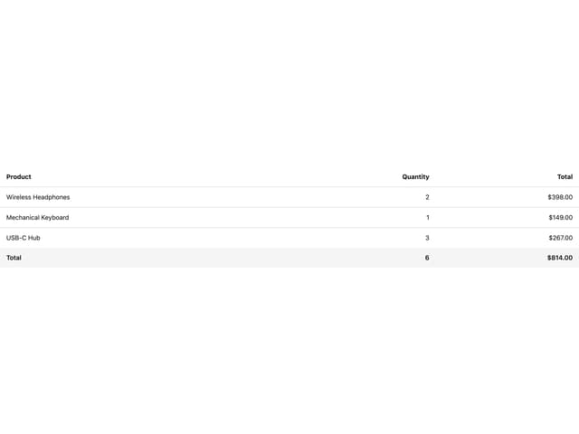
Table
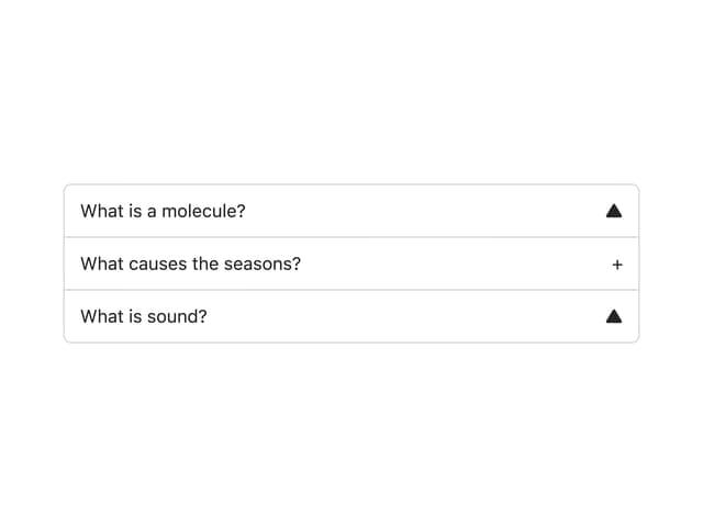
Accordion
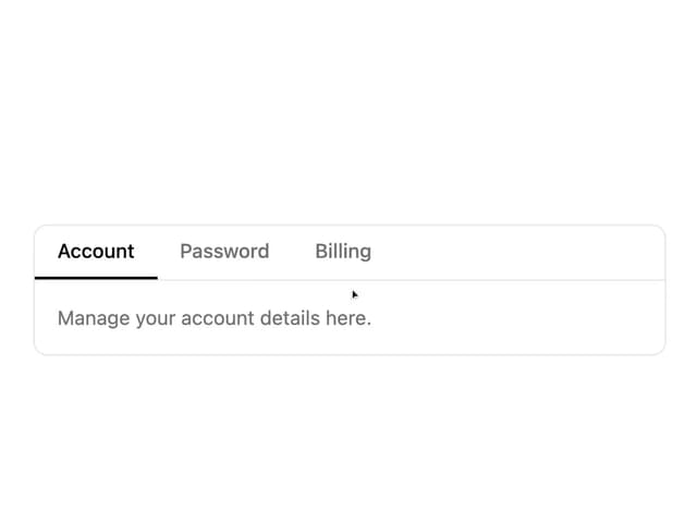
Tabs Context
More in Forms
View all

Premium Auth
500

Login 1
52
Authentication Card
47

Book A Demo 3
83
Book A Demo 1
69

Contact Card
1K

Login Card
32

Login 2
7
