
About
Here is Modal component
Built with React and Tailwind. Copy the prompt and paste it into Claude Code, Cursor or Lovable: your agent adds Modal Drop to your project and fits it to your theme.
Code
How Modal Drop is used: the demo's code. The component's own source comes with a free account.
Usage.tsx
"use client"

import * as React from "react"
import { useState } from "react"
import Modal from "@/components/ui/modal-drop"

import { Button } from "@/components/ui/button"

export default function ModalDropDemo() {
  const [isOpen, setIsOpen] = useState(false)

  const openModal = () => setIsOpen(true)
  const closeModal = () => setIsOpen(false)

  return (
    <div className="flex flex-col items-center justify-center w-full gap-4">
      <Button onClick={openModal} className="w-40">
        Open Drop Modal
      </Button>

      <Modal
        isOpen={isOpen}
        onClose={closeModal}
        title="Drop Animation Modal"
        subtitle="This modal uses default background with drop animation"
        animationType="drop"
        borderBottom
        showCloseButton
      >
        <p className="mb-4 text-muted-foreground">
          This modal demonstrates the drop animation type. The modal animates in
          from the bottom of the screen with a spring effect.
        </p>

        <p className="mb-6 text-muted-foreground">
          This animation style creates a dynamic entrance that draws attention
          while maintaining context through the blurred background. It's
          particularly effective for action confirmations or important
          notifications.
        </p>

        <div className="flex justify-end">
          <Button onClick={closeModal} variant="outline" className="mr-2">
            Cancel
          </Button>
          <Button onClick={closeModal}>Confirm</Button>
        </div>
      </Modal>
    </div>
  )
}
Dependencies
More by deltacomponents
View all
Basic Dropdown
65
Scramble text
30
Admonition
28
Auth Form
13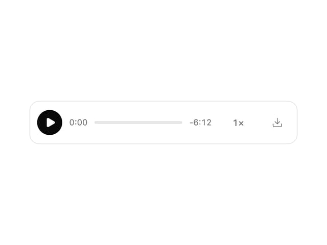
MP3 Player
12
Product Card
7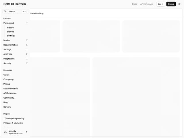
Admin Inset Layout
More in Buttons
View all

Button
14
Button
34
Texture Button
92
Button Save
46

Button
64

Button Group
3

App Store Button
454

Notification Button
103

