
About
A compound card component for e-commerce product listings with an image well, an overlaid wishlist badge, and a title/subtitle/price footer.
Built with React and Tailwind. Copy the prompt and paste it into Claude Code, Cursor or Lovable: your agent adds Product Card to your project and fits it to your theme.
Code
How Product Card is used: the demo's code. The component's own source comes with a free account.
Usage.tsx
import {
  ProductCard,
  ProductCardContent,
  ProductCardHeader,
  ProductCardImage,
  ProductCardMetric,
  ProductCardSubtitle,
  ProductCardTitle,
} from "@/components/ui/product-card";

export default function ProductCardDemo() {
  return (
    <ProductCard>
      <ProductCardImage
        src="https://cdn.21st.dev/assets/localized/fb1c2b03e0bf5da10d8286d5496e559f07f5d7e011f8f4922a601974467d7986.png"
        alt="Twemco Clock"
      />
      <ProductCardContent>
        <ProductCardHeader>
          <ProductCardTitle>Twemco Clock</ProductCardTitle>
          <ProductCardSubtitle>Clock</ProductCardSubtitle>
        </ProductCardHeader>
        <ProductCardMetric>$219</ProductCardMetric>
      </ProductCardContent>
    </ProductCard>
  );
}
More by deltacomponents
View all
Basic Dropdown
65
Scramble text
30
Admonition
28
Auth Form
13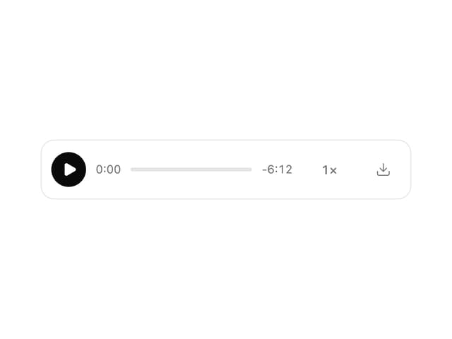
MP3 Player
12
Modal Drop
9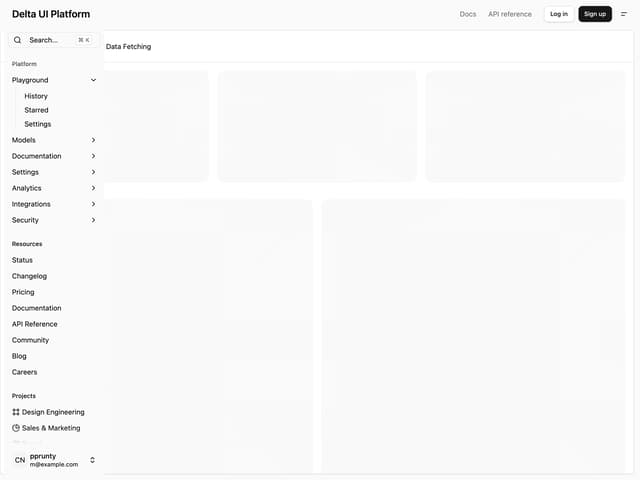
Admin Inset Layout
More in Pricing
View all
Pricing Section
575

Pricing Section
173

Pricing Card
362

Pricing Cards
85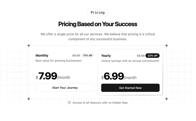
Single Pricing Card
792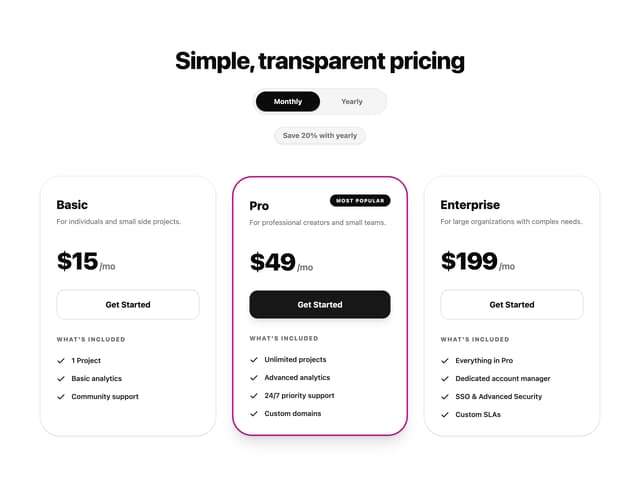
Glowing Pricing Tiers
39
pricing section
157
Colorful-Pricing
84


