
About
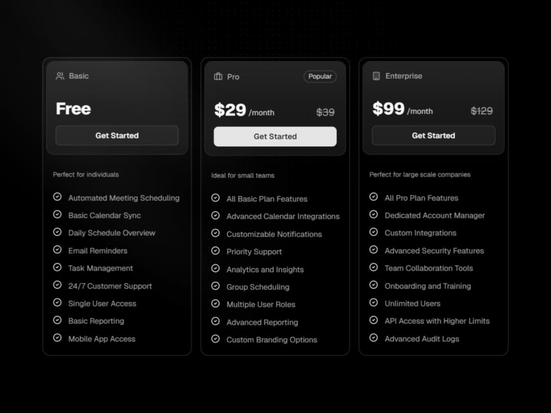
A sleek, component-based Card system with glass effects, pricing layouts, and flexible sections like header, body, and list items. Perfect for modern SaaS pricing tables, feature lists, or product showcases with consistent, stylish UI.
Built with React and Tailwind. Copy the prompt and paste it into Claude Code, Cursor or Lovable: your agent adds Pricing Card to your project and fits it to your theme.
Code
How Pricing Card is used: the demo's code. The component's own source comes with a free account.
Usage.tsx
'use client';

import { cn } from '@/lib/utils';
import { Button } from '@/components/ui/button';
import * as PricingCard from '@/components/ui/pricing-card';
import {
	CheckCircle2,
	Users,
	Building,
	Briefcase,
} from 'lucide-react';


function MultiCards() {
	const plans = [
		{
			icon: <Users />,
			description: 'Perfect for individuals',
			name: 'Basic',
			price: 'Free',
			variant: 'outline',
			features: [
				'Automated Meeting Scheduling',
				'Basic Calendar Sync',
				'Daily Schedule Overview',
				'Email Reminders',
				'Task Management',
				'24/7 Customer Support',
				'Single User Access',
				'Basic Reporting',
				'Mobile App Access',
			],
		},
		{
			icon: <Briefcase />,
			description: 'Ideal for small teams',
			name: 'Pro',
			badge: 'Popular',
			price: '$29',
			original: '$39',
			period: '/month',
			variant: 'default',
			features: [
				'All Basic Plan Features',
				'Advanced Calendar Integrations',
				'Customizable Notifications',
				'Priority Support',
				'Analytics and Insights',
				'Group Scheduling',
				'Multiple User Roles',
				'Advanced Reporting',
				'Custom Branding Options',
			],
		},
		{
			icon: <Building />,
			name: 'Enterprise',
			description: 'Perfect for large scale companies',
			price: '$99',
			original: '$129',
			period: '/month',
			variant: 'outline',
			features: [
				'All Pro Plan Features',
				'Dedicated Account Manager',
				'Custom Integrations',
				'Advanced Security Features',
				'Team Collaboration Tools',
				'Onboarding and Training',
				'Unlimited Users',
				'API Access with Higher Limits',
				'Advanced Audit Logs',
			],
		},
	];

	const handleClick = (plan: string) => {
		alert(`Selected ${plan} plan!`);
	};

	return (
		<section className="grid gap-4 p-6 md:grid-cols-3">
			{plans.map((plan) => (
				<PricingCard.Card className="md:min-w-[260px]" key={plan.name}>
					<PricingCard.Header>
						<PricingCard.Plan>
							<PricingCard.PlanName>
								{plan.icon}
								<span className="text-muted-foreground">{plan.name}</span>
							</PricingCard.PlanName>
							{plan.badge && (
								<PricingCard.Badge>{plan.badge}</PricingCard.Badge>
							)}
						</PricingCard.Plan>
						<PricingCard.Price>
							<PricingCard.MainPrice>{plan.price}</PricingCard.MainPrice>
							<PricingCard.Period>{plan.period}</PricingCard.Period>
							{plan.original && (
								<PricingCard.OriginalPrice className="ml-auto">
									{plan.original}
								</PricingCard.OriginalPrice>
							)}
						</PricingCard.Price>
						<Button
							variant={plan.variant as any}
							className={cn('w-full font-semibold')}
							onClick={() => handleClick(plan.name)}
						>
							Get Started
						</Button>
					</PricingCard.Header>

					<PricingCard.Body>
						<PricingCard.Description>
							{plan.description}
						</PricingCard.Description>
						<PricingCard.List>
							{plan.features.map((item) => (
								<PricingCard.ListItem key={item}>
									<CheckCircle2
										className="text-foreground h-4 w-4"
										aria-hidden="true"
									/>
									<span>{item}</span>
								</PricingCard.ListItem>
							))}
						</PricingCard.List>
					</PricingCard.Body>
				</PricingCard.Card>
			))}
		</section>
	);
}


export default function Page() {
	return (
		<main
			className={cn(
				'relative min-h-svh w-full overflow-hidden',
				'flex items-center justify-center p-4',
			)}
		>

      {/* Subtle dotted grid */}
			<div
				aria-hidden="true"
				className="pointer-events-none absolute inset-0"
				style={{
					backgroundImage:
						'radial-gradient(rgba(255,255,255,0.08) 0.8px, transparent 0.8px)',
					backgroundSize: '14px 14px',
					maskImage:
						'radial-gradient( circle at 50% 10%, rgba(0,0,0,1), rgba(0,0,0,0.2) 40%, rgba(0,0,0,0) 70% )',
				}}
			/>

			{/* Left spotlight */}
						<div
				aria-hidden="true"
				className="absolute inset-0 isolate hidden opacity-65 contain-strict lg:block"
			>
				<div className="absolute top-0 left-0 h-320 w-140 -translate-y-87.5 -rotate-45 rounded-full bg-[radial-gradient(68.54%_68.72%_at_55.02%_31.46%,hsla(0,0%,85%,.08)_0,hsla(0,0%,55%,.02)_50%,hsla(0,0%,45%,0)_80%)]" />
				<div className="absolute top-0 left-0 h-320 w-60 [translate:5%_-50%] -rotate-45 rounded-full bg-[radial-gradient(50%_50%_at_50%_50%,hsla(0,0%,85%,.06)_0,hsla(0,0%,45%,.02)_80%,transparent_100%)]" />
				<div className="absolute top-0 left-0 h-320 w-60 -translate-y-87.5 -rotate-45 bg-[radial-gradient(50%_50%_at_50%_50%,hsla(0,0%,85%,.04)_0,hsla(0,0%,45%,.02)_80%,transparent_100%)]" />
			</div>
			<MultiCards />
		</main>
	);
}
More by Efferd
View all

Testimonials Columns
7.1K
Zoom Parallax
5.2K
Dotted Surface
3.5K
Footer Section
2.7K
Grid Feature Cards
1.9K
Logo Cloud 2
1.6K
Header 3
1.6K
Logo Cloud 3
1.5K
More in Pricing
View all
Pricing Section
582

Pricing Section
173
pricing section
158

Pricing Cards
86
Colorful-Pricing
85
Glowing Pricing Tiers
45

RuixenPricing05
102
Single Pricing Card
795


