
About
The component will use inline styles and accept props for customization.
Built with React and Tailwind. Copy the prompt and paste it into Claude Code, Cursor or Lovable: your agent adds GLSL Hills to your project and fits it to your theme.
Code
How GLSL Hills is used: the demo's code. The component's own source comes with a free account.
Usage.tsx
import { GLSLHills } from "@/components/ui/glsl-hills";

export default function DemoOne() {
  return (
    <div className="relative flex h-full w-full flex-col items-center justify-center overflow-hidden ">
    <GLSLHills/>
    <div className="space-y-6 pointer-events-none z-10 text-center absolute">
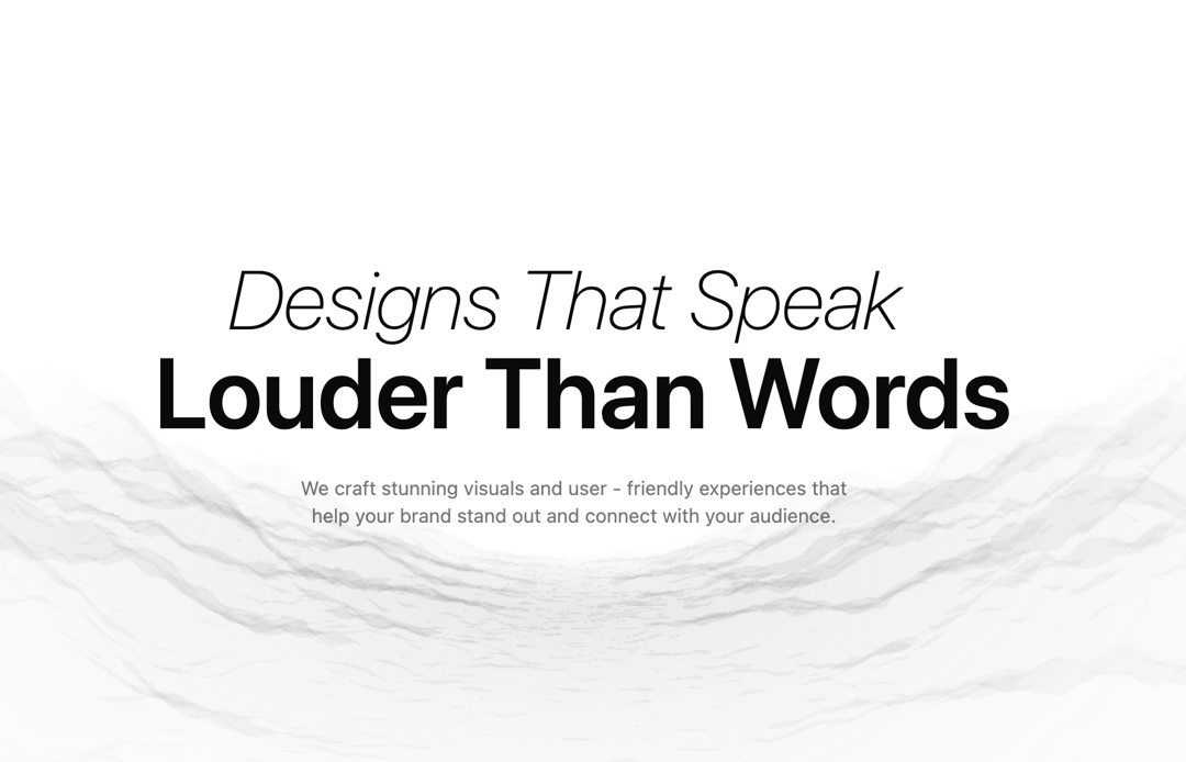
    <h1 className="font-semibold text-7xl whitespace-pre-wrap">
    <span className="italic text-6xl font-thin">Designs That Speak <br/> </span>
      Louder Than Words
        </h1>
        <p className="text-sm text-primary/60">
          We craft stunning visuals and user - friendly experiences that  <br/>  help your brand stand out and connect with your audience.
      </p>
           </div>
      </div>
  )
}
Dependencies
More by Ali Imam
View all

Liquid Glass Button
6.7K
Shader Animation
3.7K
WebGL Shader
2.6K
Shader Lines
2.3K
Shiny Button
2.2K
Canvas
1.8K
Glowing Shadow
1.5K
Gallery
1.4K
More in Heroes
View all

SaaS Template
2.4K
Centered Hero with Image Fan
930

Hero
1.2K

Responsive Hero Banner
2K

Minimalist Hero Fashion
285

Home Section
66

Hero Section 6
881
Hero Golden Spiral
101
