
About
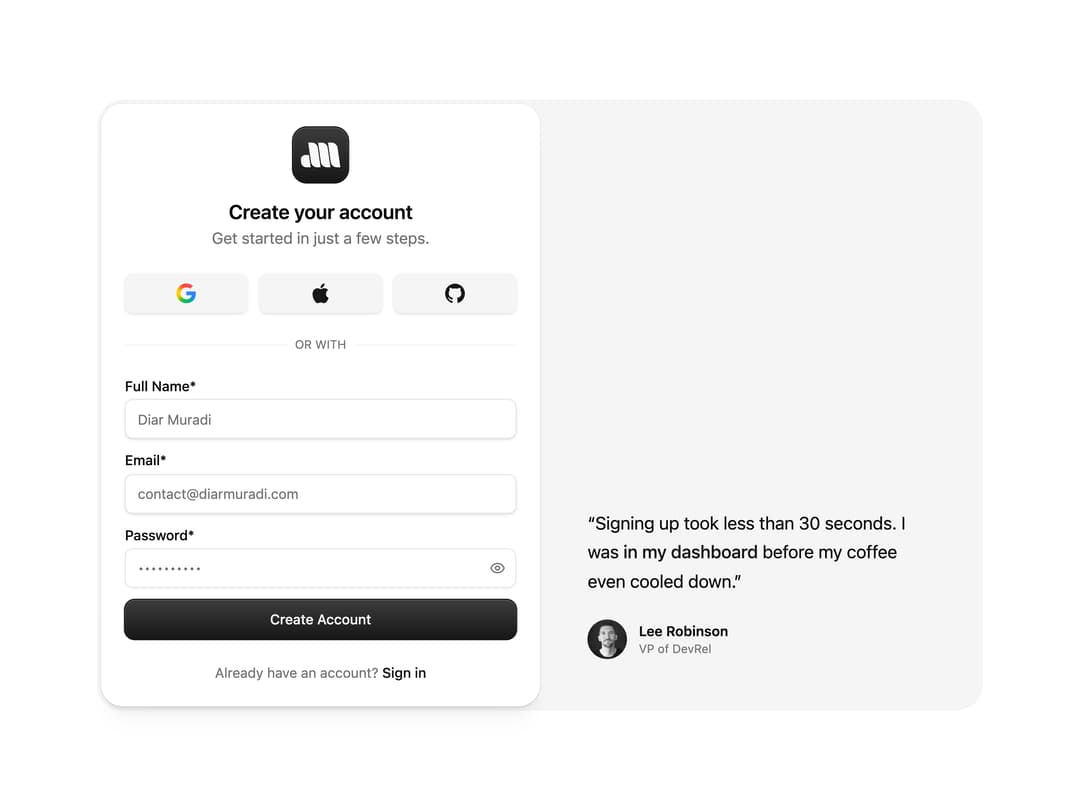
A two-column sign-up form with social auth buttons, a password field with a show/hide toggle, and a testimonial panel with an avatar shown beside the form on large screens.
Built with React and Tailwind. Copy the prompt and paste it into Claude Code, Cursor or Lovable: your agent adds Sign Up Split Panel to your project and fits it to your theme.
Code
How Sign Up Split Panel is used: the demo's code. The component's own source comes with a free account.
Usage.tsx
import SignUp from "@/components/ui/sign-up-1";

export default function SignUpDemo() {
  return (
    <div className="flex min-h-screen w-full items-center justify-center bg-background p-6">
      <SignUp />
    </div>
  );
}
Dependencies
More by Diar Muradi
View all

Toggleable Add-on Pricing
154
Toggle Pricing Cards
78
ROI Pricing Calculator
49
Pricing With FAQ
43
Volume Pricing Card
31
Logo Orbit
27
Sticky Header Navbar
19
FAQ Snapshot Grid
19
More in Testimonials
View all

Testimonial
117
testimonial
797

Staggered Testimonials Grid
143
Testimonial 2
32

Voice Testimonial
120
Testimonial Card
69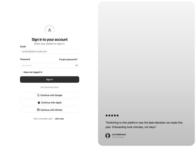
Split Sign In Form
16
Testimonials Marquee
574


