About
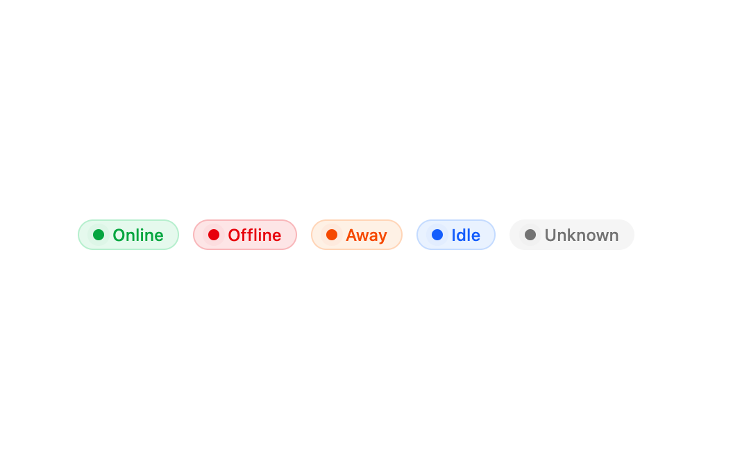
A pill-shaped status badge with a pulsing indicator dot and color variants for signaling online, error, warning, info, and idle states.
Built with React and Tailwind. Copy the prompt and paste it into Claude Code, Cursor or Lovable: your agent adds Status to your project and fits it to your theme.
Code
How Status is used: the demo's code. The component's own source comes with a free account.
Usage.tsx
import { Status, StatusIndicator, StatusLabel } from "@/components/ui/status";

export default function StatusDemo() {
  return (
    <div className="flex flex-wrap items-center gap-2.5">
      <Status variant="success">
        <StatusIndicator />
        <StatusLabel>Online</StatusLabel>
      </Status>

      <Status variant="error">
        <StatusIndicator />
        <StatusLabel>Offline</StatusLabel>
      </Status>

      <Status variant="warning">
        <StatusIndicator />
        <StatusLabel>Away</StatusLabel>
      </Status>

      <Status variant="info">
        <StatusIndicator />
        <StatusLabel>Idle</StatusLabel>
      </Status>

      <Status variant="default">
        <StatusIndicator />
        <StatusLabel>Unknown</StatusLabel>
      </Status>
    </div>
  );
}
Dependencies
More by Dice UI
View all

Compare Slider
75
Sortable
49
Circular Progress
41
Pending
27
Banner
18
Stack
7
Scroller
5
Mention
4