About
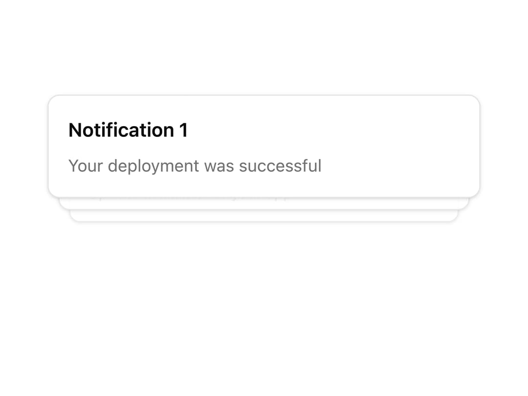
A stacked card/notification layout (like Sonner's toast stacking) whose items expand into a fanned-out list on hover.
Built with React and Tailwind. Copy the prompt and paste it into Claude Code, Cursor or Lovable: your agent adds Stack to your project and fits it to your theme.
Code
How Stack is used: the demo's code. The component's own source comes with a free account.
Usage.tsx
import { Stack, StackItem } from "@/components/ui/stack";

export default function StackDemo() {
  return (
    <Stack className="w-[360px]" expandOnHover>
      <StackItem className="flex flex-col gap-2">
        <h3 className="font-semibold">Notification 1</h3>
        <p className="text-sm text-muted-foreground">
          Your deployment was successful
        </p>
      </StackItem>
      <StackItem className="flex flex-col gap-2">
        <h3 className="font-semibold">Notification 2</h3>
        <p className="text-sm text-muted-foreground">
          New message from John Doe
        </p>
      </StackItem>
      <StackItem className="flex flex-col gap-2">
        <h3 className="font-semibold">Notification 3</h3>
        <p className="text-sm text-muted-foreground">
          Update available for your app
        </p>
      </StackItem>
    </Stack>
  );
}
Dependencies
More by Dice UI
View all

Compare Slider
75
Sortable
49
Circular Progress
41
Status
28
Pending
27
Banner
19
Scroller
5
Mention
4
More in Cards
View all

Statistics Card 2
263
Card
70
Stats cards with links
39

Course Design Cards
1.1K
The Item one
3

Card Studio
7
Statistics Card 7
290

Item
10
