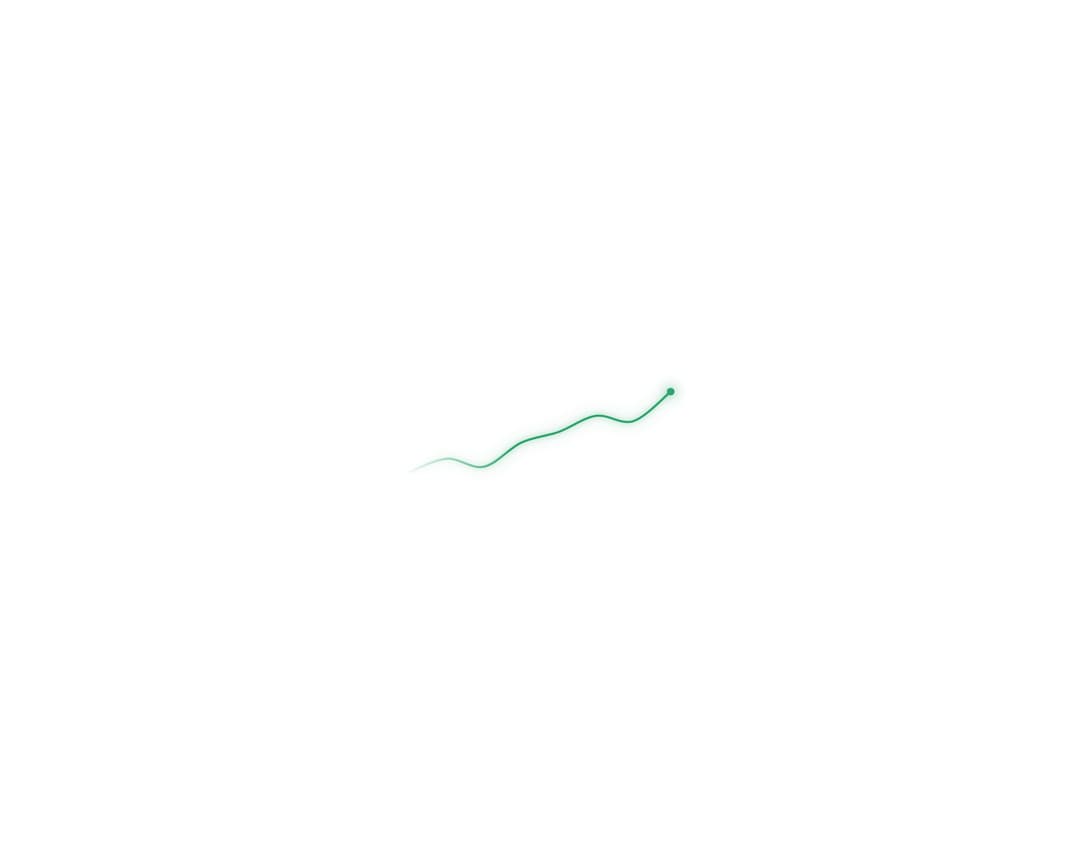
A compact SVG sparkline that draws itself, morphs between trend states, and shifts color for positive or negative movement. The exported AnimatedSparkline wraps it in a card with a label, an animated headline value, and a trend percentage (green up / red down); the underlying Sparkline is a standalone primitive with smooth or sharp curves, an optional soft glow, a fading left edge, an animated endpoint dot, and a replayable self-drawing reveal. Built with @number-flow/react for the value spin.
Built with React and Tailwind. Copy the prompt and paste it into Claude Code, Cursor or Lovable: your agent adds Animated Sparkline to your project and fits it to your theme.
Code
How Animated Sparkline is used: the demo's code. The component's own source comes with a free account.
Usage.tsx
"use client";

import { Sparkline } from "@/components/ui/animated-sparkline";

const data = [
  { label: "Jan", value: 42 },
  { label: "Feb", value: 47 },
  { label: "Mar", value: 44 },
  { label: "Apr", value: 53 },
  { label: "May", value: 57 },
  { label: "Jun", value: 63 },
  { label: "Jul", value: 61 },
  { label: "Aug", value: 72 },
];

export default function BareSparkline() {
  return (
    <div className="flex min-h-screen w-full items-center justify-center bg-white p-8">
      <div className="w-64" style={{ color: "#30a46c" }}>
        <Sparkline ariaLabel="Revenue trend up" data={data} glow showEndpoint />
      </div>
    </div>
  );
}
Dependencies
More by dqnamo
View all

Agent Dock
538
Animated Banner
335
Scroll Fade List
298
Model Selector Prompt
154
Game of Life Loader
127
Animated Signature
55
Iridescent Foil
52
Dynamic Button
44