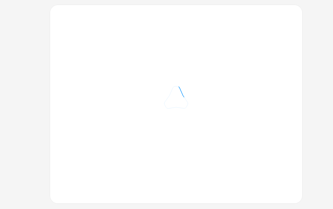
A compact reveal pattern: a self-contained SVG loader traces your logo's outline while work is in progress, then resolves into the filled logo mark when loading completes. A short dashed segment loops around a single continuous contour; when isComplete (or loading turns false) it closes the outline and fades in the filled compound shapes, calling onDone exactly once. Configurable size, stroke width, loop and fill-fade durations; colors follow currentColor; respects reduced motion with timeout fallbacks and a stable footprint.
Built with React and Tailwind. Copy the prompt and paste it into Claude Code, Cursor or Lovable: your agent adds Logo Trace Loader to your project and fits it to your theme.
Code
How Logo Trace Loader is used: the demo's code. The component's own source comes with a free account.
Usage.tsx
"use client";

import { useEffect, useRef, useState } from "react";
import { LogoTraceLoader } from "@/components/ui/logo-trace-loader";

export default function Default() {
  const [loading, setLoading] = useState(true);
  const [resolved, setResolved] = useState(false);
  const timer = useRef<ReturnType<typeof setTimeout> | null>(null);

  // Trace while "work" is in progress, then complete once data is ready.
  useEffect(() => {
    if (!loading) {
      return;
    }
    timer.current = setTimeout(() => setLoading(false), 2200);
    return () => {
      if (timer.current) {
        clearTimeout(timer.current);
      }
    };
  }, [loading]);

  function replay() {
    if (timer.current) {
      clearTimeout(timer.current);
    }
    setResolved(false);
    setLoading(true);
  }

  return (
    <div className="flex min-h-screen w-full items-center justify-center bg-neutral-100 p-8">
      <div className="flex w-full max-w-md flex-col gap-3">
        <div className="rounded-xl border border-neutral-200 bg-white">
          <div className="flex min-h-[22rem] flex-col items-center justify-center gap-6 p-6">
            {/* logo traces in blue, resolves into the filled mark, then
                settles to the foreground color as the content appears */}
            <div
              className={`transition-colors duration-200 ${resolved ? "text-neutral-900" : "text-[#0090ff]"}`}
            >
              <LogoTraceLoader
                loading={loading}
                onDone={() => setResolved(true)}
                size={44}
              />
            </div>

            {/* content panel expands once the logo has resolved, shifting the
                centered logo up */}
            <div
              className="grid w-full transition-all duration-700 ease-out"
              style={{
                gridTemplateRows: resolved ? "1fr" : "0fr",
                opacity: resolved ? 1 : 0,
              }}
            >
              <div className="overflow-hidden">
                <div className="rounded-lg border border-neutral-200 p-4">
                  <p className="font-medium text-neutral-900 text-sm">Sign In</p>
                  <p className="mt-1 text-neutral-500 text-sm leading-relaxed">
                    Enter your email and we'll send you a verification code.
                    We'll create your account too if you don't already have one.
                  </p>
                  <input
                    className="mt-4 w-full bg-transparent text-neutral-900 text-sm outline-none placeholder:text-neutral-400"
                    placeholder="you@email.com"
                    type="email"
                  />
                  <div className="mt-4 flex justify-end">
                    <button
                      className="rounded-lg bg-neutral-900 px-3 py-1.5 text-sm font-medium text-white transition-colors hover:bg-neutral-800"
                      type="button"
                    >
                      Send code
                    </button>
                  </div>
                </div>
              </div>
            </div>
          </div>
        </div>

        <div className="flex items-center justify-between rounded-xl border border-neutral-200 bg-white px-4 py-3">
          <span className="flex items-center gap-2 text-neutral-500 text-sm">
            <span
              className={
                resolved
                  ? "size-2 rounded-full bg-emerald-500"
                  : "size-2 animate-pulse rounded-full bg-neutral-300"
              }
            />
            {resolved ? "Ready" : "Loading..."}
          </span>
          <button
            className="inline-flex items-center gap-1.5 rounded-lg border border-neutral-200 bg-white px-2.5 py-1.5 text-sm font-medium text-neutral-700 transition-colors hover:bg-neutral-50"
            onClick={replay}
            type="button"
          >
            <svg
              aria-hidden="true"
              className="size-3.5"
              fill="none"
              stroke="currentColor"
              strokeLinecap="round"
              strokeLinejoin="round"
              strokeWidth="2"
              viewBox="0 0 24 24"
            >
              <path d="M21 12a9 9 0 1 1-2.64-6.36M21 3v6h-6" />
            </svg>
            Replay
          </button>
        </div>
      </div>
    </div>
  );
}
More by dqnamo
View all

Agent Dock
538
Animated Banner
335
Scroll Fade List
298
Model Selector Prompt
154
Game of Life Loader
127
Animated Signature
55
Iridescent Foil
52
Dynamic Button
44