
About
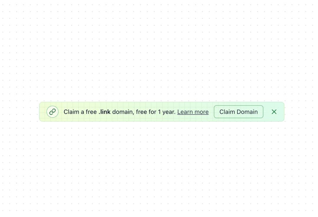
A versatile notification banner component with gradient background and grid pattern overlay. Originally designed for Dub.co's domain claim notifications. Features - Dismissible banner with close button - Optional icon with circular background - Customizable action button - "Learn more" link support - Responsive layout (mobile/desktop) - Built-in grid pattern background
Built with React and Tailwind. Copy the prompt and paste it into Claude Code, Cursor or Lovable: your agent adds Banner to your project and fits it to your theme.
Code
How Banner is used: the demo's code. The component's own source comes with a free account.
Usage.tsx
"use client"

import { useState } from "react"
import { LinkIcon } from "lucide-react"
import { Banner } from "@/components/ui/banner"

export function BannerDemo() {
  const [show, setShow] = useState(true)

  return (
    <Banner
      show={show}
      onHide={() => setShow(false)}
      icon={<LinkIcon className="m-px h-4 w-4 text-green-800" />}
      title={
        <>
          Claim a free <span className="font-semibold">.link</span> domain, free
          for 1 year.
        </>
      }
      action={{
        label: "Claim Domain",
        onClick: () => console.log("Claim domain clicked"),
      }}
      learnMoreUrl="https://dub.co/help/article/free-dot-link-domain"
    />
  )
}
Dependencies
More by Dub.co
View all
Sidebar News
902
More in Buttons
View all

Button
14
Button
34
Texture Button
92
Button Save
46

Button
64

Button Group
3

App Store Button
454

Notification Button
103

