
About
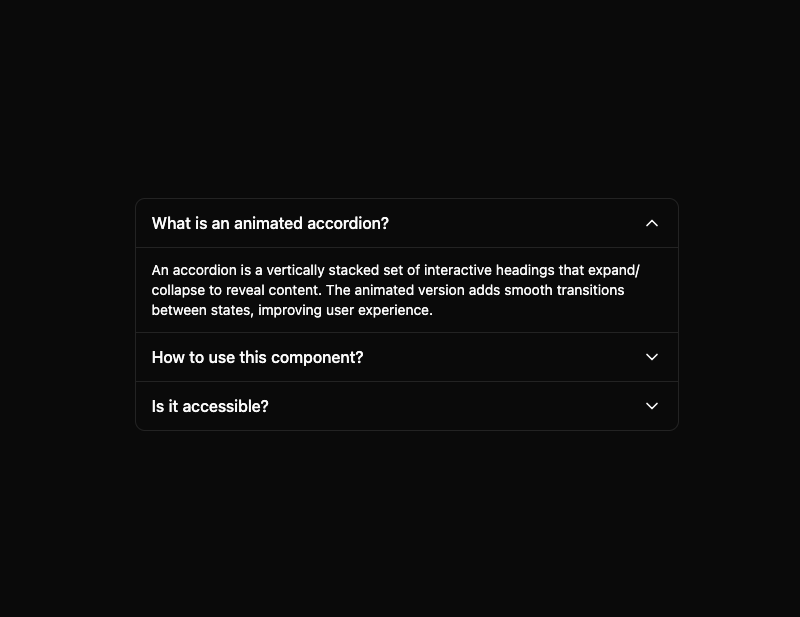
Here is Basic Accordion component
Built with React and Tailwind. Copy the prompt and paste it into Claude Code, Cursor or Lovable: your agent adds Basic Accordion to your project and fits it to your theme.
Code
How Basic Accordion is used: the demo's code. The component's own source comes with a free account.
Usage.tsx
"use client"

import React from "react"

import BasicAccordion from "@/components/ui/basic-accordion"

const accordionItems = [
  {
    id: 1,
    title: "What is an animated accordion?",
    content: (
      <p className="text-sm">
        An accordion is a vertically stacked set of interactive headings that
        expand/collapse to reveal content. The animated version adds smooth
        transitions between states, improving user experience.
      </p>
    ),
  },
  {
    id: 2,
    title: "How to use this component?",
    content: (
      <div className="space-y-2 text-sm">
        <p>
          Import the component and provide an array of items with{" "}
          <code>id</code>, <code>title</code>, and <code>content</code>. You can
          also customize behavior with props like <code>allowMultiple</code> and{" "}
          <code>defaultExpandedIds</code>.
        </p>
        <pre className="bg-primary text-black font-mono overflow-x-auto rounded border p-2">
          {`<BasicAccordion
  items={accordionItems}
  allowMultiple={true}
  defaultExpandedIds={[1]}
/>`}
        </pre>
      </div>
    ),
  },
  {
    id: 3,
    title: "Is it accessible?",
    content: (
      <p className="text-sm">
        Yes! The component follows accessibility guidelines by using proper ARIA
        attributes, supporting keyboard navigation, and maintaining focus
        properly through interactions.
      </p>
    ),
  },
]

const AccordionDemo = () => {
  return (
    <div className="w-full max-w-xl p-4">
      <BasicAccordion
        items={accordionItems}
        allowMultiple={true}
        defaultExpandedIds={[1]}
        className="bg-background border"
      />
    </div>
  )
}

export default AccordionDemo
Dependencies
More by Edu Calvo
View all

Scrollable Card Stack
234
Siri Orb
160
AI Task List
159
Cursor Follow
153
Pixel Flow Field
141
Agent Avatar
128
Gravity Stars
111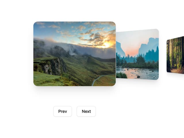
Coverflow Carousel
94