
About
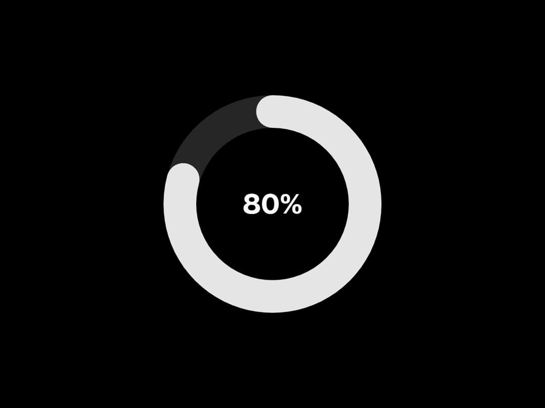
This CircularProgress component shows a smooth, animated ring to display progress in a clean, modern style. You can choose between a full circle or a gaped version, customize colors, stroke, and see the percentage right in the center!
Built with React and Tailwind. Copy the prompt and paste it into Claude Code, Cursor or Lovable: your agent adds Circular Progress to your project and fits it to your theme.
Code
How Circular Progress is used: the demo's code. The component's own source comes with a free account.
Usage.tsx
import React from 'react';
import { CircularProgress } from "@/components/ui/circular-progress";

function useSampleValue(defaultValue: number = 0) {
  const [value, setValue] = React.useState(defaultValue);

  React.useEffect(() => {
    const handleIncrement = (prev: number) => {
      if (prev === 100) {
        return 0;
      }
      return prev + 10;
    };
    setValue(handleIncrement);
    const interval = setInterval(() => setValue(handleIncrement), 2000);
    return () => clearInterval(interval);
  }, []);

  return value;
}

export default function Demo() {
	const value = useSampleValue();
	return (
		<div className="flex min-h-screen w-full items-center justify-center">
			<CircularProgress value={value} />
		</div>
	);
}More by Efferd
View all

Testimonials Columns
7.1K
Zoom Parallax
5.2K
Dotted Surface
3.5K
Footer Section
2.7K
Grid Feature Cards
1.9K
Logo Cloud 2
1.6K
Header 3
1.6K
Logo Cloud 3
1.5K