
About
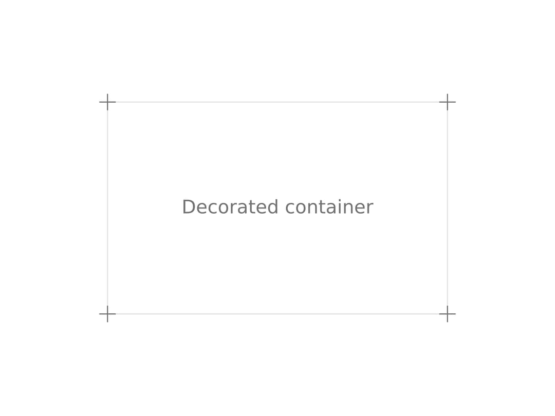
A small decorative plus-shaped icon that positions itself at the corners of a bordered container.
Built with React and Tailwind. Copy the prompt and paste it into Claude Code, Cursor or Lovable: your agent adds Decor Icon to your project and fits it to your theme.
Code
How Decor Icon is used: the demo's code. The component's own source comes with a free account.
Usage.tsx
import { DecorIcon } from "@/components/ui/decor-icon";

export default function DecorIconDemo() {
	return (
		<div className="flex min-h-64 items-center justify-center p-10">
			<div className="relative flex h-40 w-64 items-center justify-center border border-border text-sm text-muted-foreground">
				Decorated container
				<DecorIcon position="top-left" />
				<DecorIcon position="top-right" />
				<DecorIcon position="bottom-right" />
				<DecorIcon position="bottom-left" />
			</div>
		</div>
	);
}
Dependencies
More by Efferd
View all

Testimonials Columns
7.1K
Zoom Parallax
5.2K
Dotted Surface
3.5K
Footer Section
2.7K
Grid Feature Cards
1.9K
Logo Cloud 2
1.6K
Header 3
1.6K
Logo Cloud 3
1.5K