
About
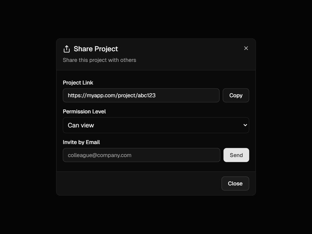
a beautifully structured Dialog component built using Radix UI primitives with custom styling and slots for full flexibility. It offers smooth animations, a blurred backdrop, responsive sizing, and optional close buttons—making it ideal for modals, alerts, or form popups in any modern React app.
Built with React and Tailwind. Copy the prompt and paste it into Claude Code, Cursor or Lovable: your agent adds Dialog to your project and fits it to your theme.
Code
How Dialog is used: the demo's code. The component's own source comes with a free account.
Usage.tsx
import React from 'react';
import {
	Dialog,
	DialogBody,
	DialogClose,
	DialogContent,
	DialogDescription,
	DialogFooter,
	DialogHeader,
	DialogTitle,
	DialogTrigger,
} from '@/components/ui/dialog';
import { Button } from '@/components/ui/button';
import { Input } from '@/components/ui/input';
import { Label } from '@/components/ui/label';
import { Share } from 'lucide-react';

export default function ShareDialog() {
	const [shareUrl] = React.useState('https://myapp.com/project/abc123');
	const [copied, setCopied] = React.useState(false);

	const copyToClipboard = () => {
		navigator.clipboard.writeText(shareUrl);
		setCopied(true);
		setTimeout(() => setCopied(false), 2000);
	};

	return (
		<Dialog>
			<DialogTrigger asChild>
				<Button variant="outline">Share Project</Button>
			</DialogTrigger>
			<DialogContent>
				<DialogHeader>
					<DialogTitle className="flex items-center justify-center sm:justify-start gap-2">
						<Share className="h-5 w-5" />
						Share Project
					</DialogTitle>
					<DialogDescription>Share this project with others</DialogDescription>
				</DialogHeader>
				<DialogBody>
					<div className="space-y-4">
						<div>
							<Label htmlFor="share-link">Project Link</Label>
							<div className="mt-2 flex gap-2">
								<Input
									id="share-link"
									value={shareUrl}
									readOnly
									className="flex-1"
								/>
								<Button
									onClick={copyToClipboard}
									variant="outline"
									className={copied ? 'text-green-600' : ''}
								>
									{copied ? 'Copied!' : 'Copy'}
								</Button>
							</div>
						</div>
						<div>
							<Label htmlFor="permissions">Permission Level</Label>
							<select
								id="permissions"
								className="mt-2 w-full rounded-md border p-2"
							>
								<option>Can view</option>
								<option>Can comment</option>
								<option>Can edit</option>
							</select>
						</div>
						<div>
							<Label htmlFor="invite-email">Invite by Email</Label>
							<div className="mt-2 flex gap-2">
								<Input
									id="invite-email"
									placeholder="colleague@company.com"
									className="flex-1"
								/>
								<Button>Send</Button>
							</div>
						</div>
					</div>
				</DialogBody>
				<DialogFooter>
					<DialogClose asChild>
						<Button variant="outline">Close</Button>
					</DialogClose>
				</DialogFooter>
			</DialogContent>
		</Dialog>
	);
}
Dependencies
More by Efferd
View all

Testimonials Columns
7.1K
Zoom Parallax
5.2K
Dotted Surface
3.5K
Footer Section
2.7K
Grid Feature Cards
1.9K
Logo Cloud 2
1.6K
Header 3
1.6K
Logo Cloud 3
1.5K
More in Buttons
View all
Button Save
46

Button
20

Eclipse Button
5

Button
32

Button
6

Button
14

Button Group
37
Split Button
32

