
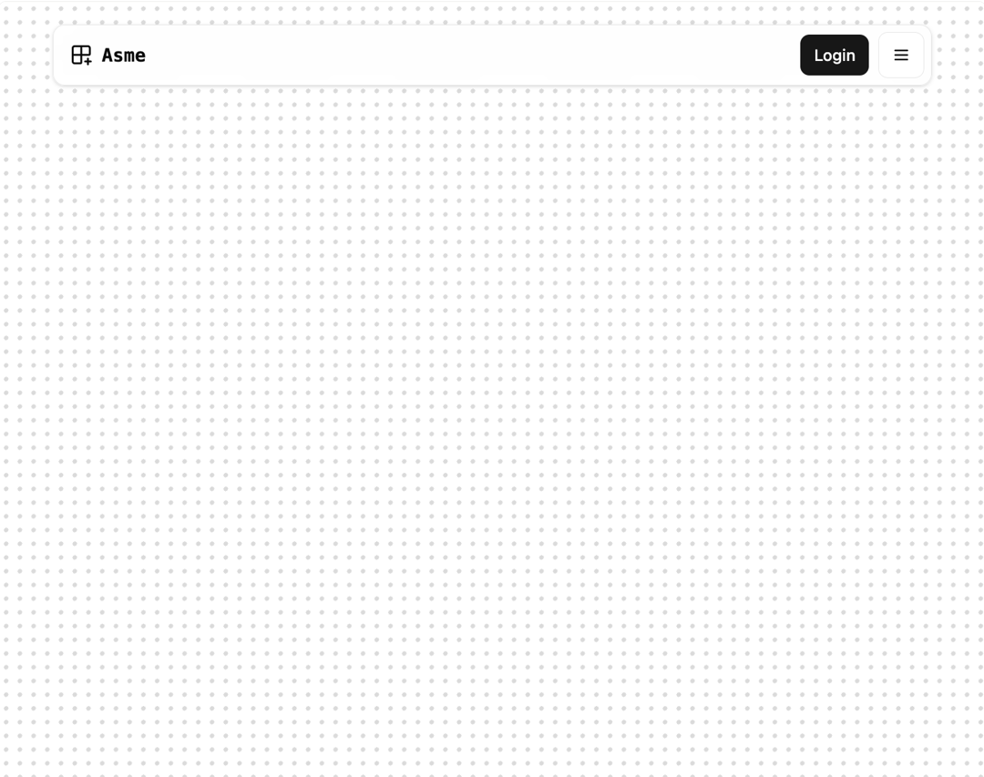
About
a sleek, sticky navigation bar that stays visible while you scroll, ensuring quick access to essential links. With a rounded glass-like design, mobile-friendly drawer menu, and smooth hover effects, it delivers a premium user experience. Perfect for landing pages, SaaS apps, or blogs, it combines elegance and usability in one compact component.
Built with React and Tailwind. Copy the prompt and paste it into Claude Code, Cursor or Lovable: your agent adds Floating Header to your project and fits it to your theme.
Code
How Floating Header is used: the demo's code. The component's own source comes with a free account.
Usage.tsx
import { FloatingHeader } from "@/components/ui/floating-header";
import { cn } from '@/lib/utils';

export default function DemoOne() {
 return (
		<div className="relative w-full px-4">
			<FloatingHeader />
			<div className="min-h-screen py-10" />

			{/* Dots */}
			<div
				aria-hidden="true"
				className={cn(
					'absolute inset-0 -z-10 size-full',
					'bg-[radial-gradient(color-mix(in_oklab,--theme(--color-foreground/.5)30%,transparent)_2px,transparent_2px)]',
					'bg-[size:12px_12px]',
				)}
			/>
		</div>
	);
}
Dependencies
More by Efferd
View all

Testimonials Columns
7.1K
Zoom Parallax
5.2K
Dotted Surface
3.5K
Footer Section
2.7K
Grid Feature Cards
1.9K
Logo Cloud 2
1.6K
Header 3
1.6K
Logo Cloud 3
1.5K