About
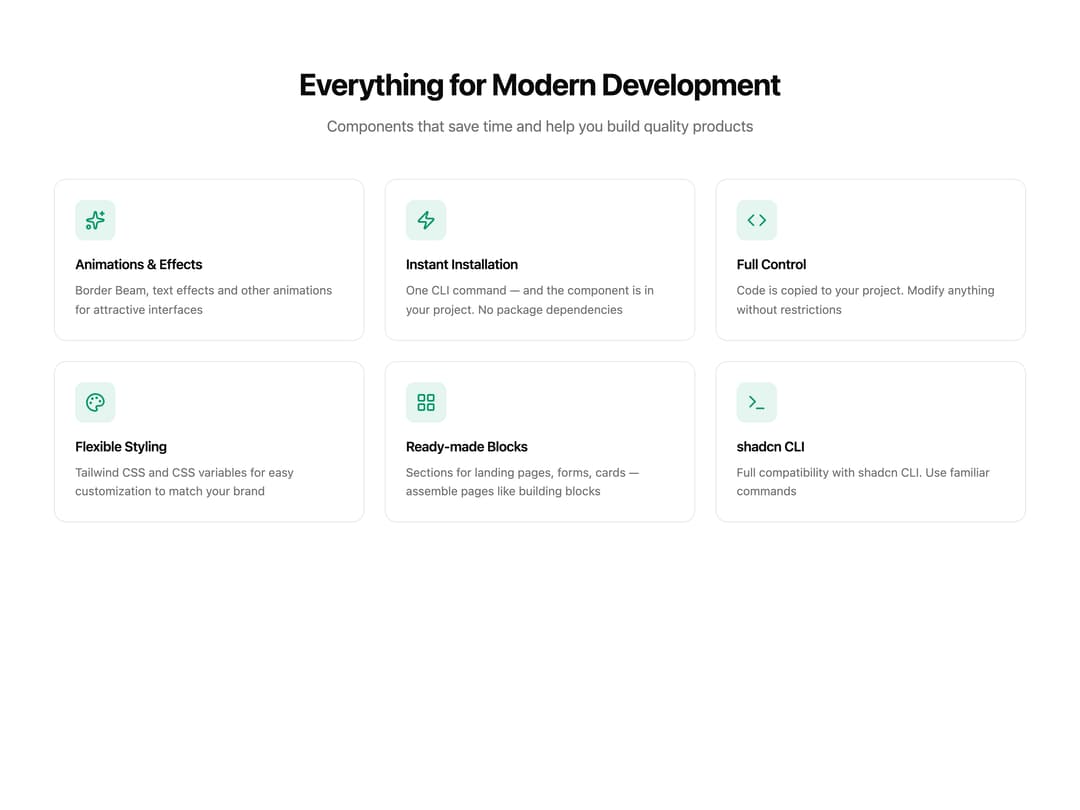
A responsive grid of product feature cards with icons, titles and descriptions for landing page sections.
Built with React and Tailwind. Copy the prompt and paste it into Claude Code, Cursor or Lovable: your agent adds Features Grid to your project and fits it to your theme.
Code
How Features Grid is used: the demo's code. The component's own source comes with a free account.
Usage.tsx
import FeaturesGrid from "@/components/ui/features-grid";

export default function Default() {
  return (
    <div className="min-h-screen w-full bg-background text-foreground">
      <FeaturesGrid />
    </div>
  );
}
Dependencies
More by gooseui
View all

Border Beam
124
Typography
More in Features
View all

Features 8
3K

Feature Sections
52

Grid Feature Cards
1.9K
Features Card
200
Feature with image
149
Feature Modern
20
Feature with advantages
278
Features 1
278


