
About
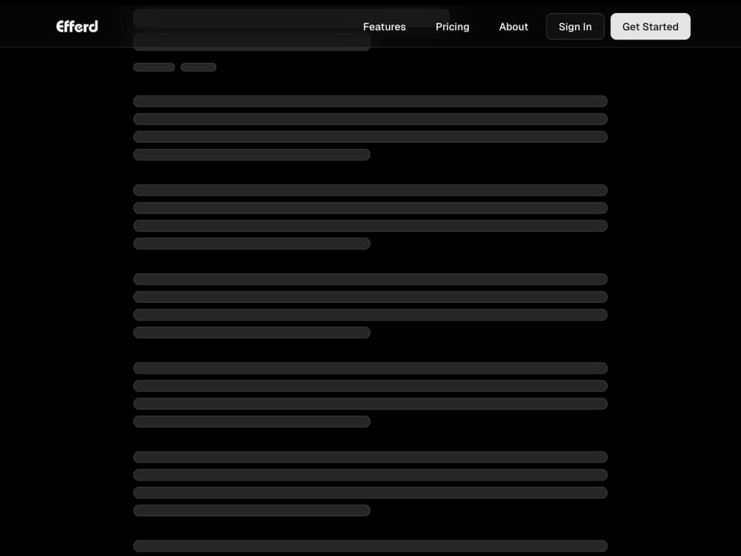
Responsive sticky header with scroll blur effect, animated mobile menu, and adaptive navigation links.
Built with React and Tailwind. Copy the prompt and paste it into Claude Code, Cursor or Lovable: your agent adds Header 1 to your project and fits it to your theme.
Code
How Header 1 is used: the demo's code. The component's own source comes with a free account.
Usage.tsx
import React from 'react';
import { Header } from "@/components/ui/header-1";

export default function Demo() {
	return (
		<div className="w-full">
			<Header />

			<main className="mx-auto min-h-screen w-full max-w-3xl px-4 py-12">
				<div  className="space-y-2 mb-4">
					<div className="bg-accent h-6 w-4/6 rounded-md border" />
					<div className="bg-accent h-6 w-1/2 rounded-md border" />
				</div>
				<div  className="flex gap-2 mb-8">
					<div className="bg-accent h-3 w-14 rounded-md border" />
					<div className="bg-accent h-3 w-12 rounded-md border" />
				</div>

				{Array.from({ length: 7 }).map((_, i) => (
					<div key={i} className="space-y-2 mb-8">
						<div className="bg-accent h-4 w-full rounded-md border" />
						<div className="bg-accent h-4 w-full rounded-md border" />
						<div className="bg-accent h-4 w-full rounded-md border" />
						<div className="bg-accent h-4 w-1/2 rounded-md border" />
					</div>
				))}
			</main>
		</div>
	);
}
More by Efferd
View all

Testimonials Columns
7.1K
Zoom Parallax
5.2K
Dotted Surface
3.5K
Footer Section
2.7K
Grid Feature Cards
1.9K
Logo Cloud 2
1.6K
Header 3
1.6K
Logo Cloud 3
1.5K
More in Navigation
View all

Sidebar
234

Tabs
60
Newsletter Signup Footer
16
Progress Bar Stepper
36
Footer 2
201
Navbar with Theme Toggle
43

Navbar
71

Pagination
86
