

About
A split section with a heading and a masked grid of scattered rounded cards displaying integration logos.
Built with React and Tailwind. Copy the prompt and paste it into Claude Code, Cursor or Lovable: your agent adds Integrations Grid to your project and fits it to your theme.
Code
How Integrations Grid is used: the demo's code. The component's own source comes with a free account.
Usage.tsx
import Integrations from "@/components/ui/integrations-4";

export default function IntegrationsDemo() {
	return (
		<div className="flex min-h-svh w-full items-center justify-center p-6">
			<Integrations />
		</div>
	);
}
More by Efferd
View all

Testimonials Columns
7.1K
Zoom Parallax
5.2K
Dotted Surface
3.5K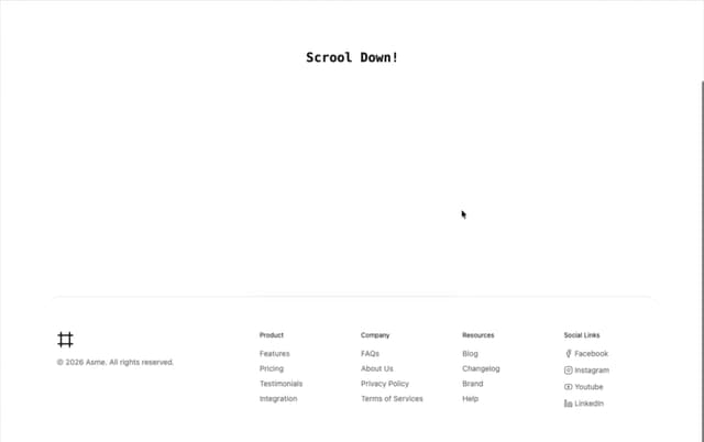
Footer Section
2.7K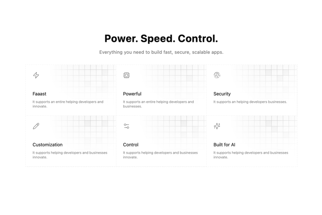
Grid Feature Cards
1.9K
Logo Cloud 2
1.6K
Header 3
1.6K
Logo Cloud 3
1.5K
More in Features
View all

Features 8
3.1K
Features 2
322

Feature Sections
52
Feature with advantages
278
Feature Section with card gradient
169
Feature Modern
17
Features 4
368

Framework Agnostic
63


