
About
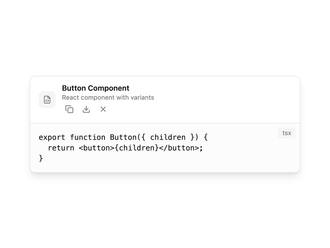
A compound card component for displaying AI-generated artifacts like code snippets, documents, or previews, with a header, title, action buttons (run, copy, regenerate, download, share) and a close control.
Built with React and Tailwind. Copy the prompt and paste it into Claude Code, Cursor or Lovable: your agent adds AI Artifact to your project and fits it to your theme.
Code
How AI Artifact is used: the demo's code. The component's own source comes with a free account.
Usage.tsx
import {
  AiArtifact,
  AiArtifactHeader,
  AiArtifactTitle,
  AiArtifactDescription,
  AiArtifactActions,
  AiArtifactAction,
  AiArtifactContent,
  AiArtifactCode,
} from "@/components/ui/ai-artifact";

export default function AiArtifactDemo() {
  return (
    <div className="flex w-full items-center justify-center p-10">
      <AiArtifact
        className="w-full max-w-lg"
        onClose={() => console.log("closed")}
      >
        <AiArtifactHeader>
          <div>
            <AiArtifactTitle>Button Component</AiArtifactTitle>
            <AiArtifactDescription>
              React component with variants
            </AiArtifactDescription>
          </div>
          <AiArtifactActions>
            <AiArtifactAction type="copy" onClick={() => {}} />
            <AiArtifactAction type="download" onClick={() => {}} />
          </AiArtifactActions>
        </AiArtifactHeader>
        <AiArtifactContent>
          <AiArtifactCode
            language="tsx"
            code={`export function Button({ children }) {
  return <button>{children}</button>;
}`}
          />
        </AiArtifactContent>
      </AiArtifact>
    </div>
  );
}
Dependencies
More by Cameron Kelliher
View all
AI Chain of Thought
111
Helix Loader
94
AI Streaming Text
50
AI Tool Call
45
Signal Bars Loader
41
Glitch Text Loader
41
AI Prompt Diff
39
AI Routing Indicator
34
More in AI chats
View all

AI Actions
319
Agent Chat
17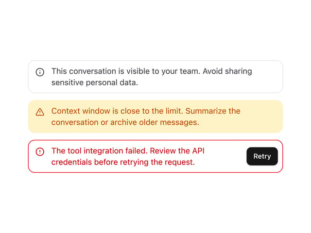

System Message
54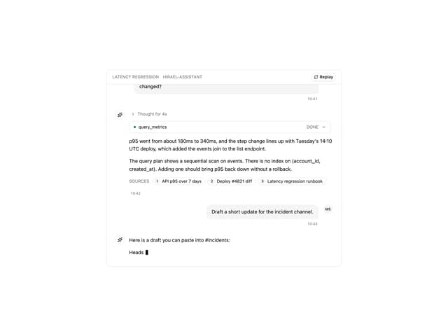
Message Thread
35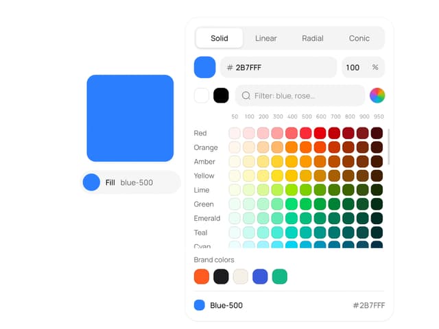
Color Picker
81

AI Task List
160

Modal Card
101
Quota Banner
21


