
About
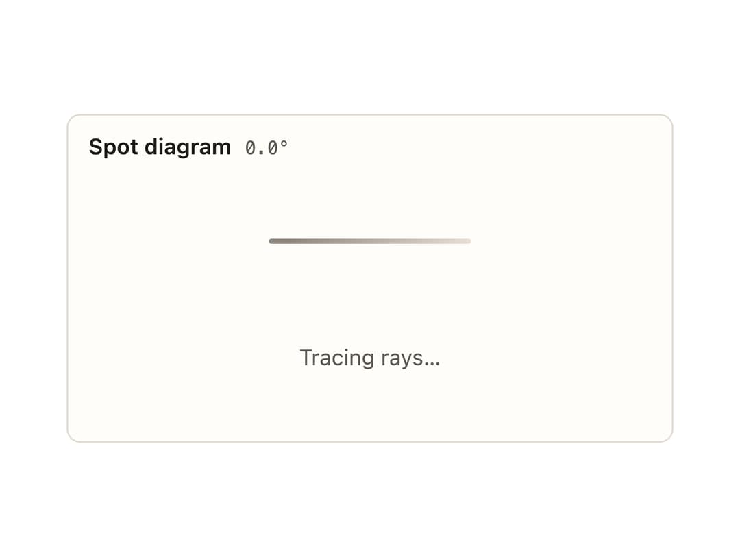
A card frame for a data plot or chart with a title, metadata, color-key, header actions, loading/empty/error/stale states, and an optional footer for a legend. Ported to React from the Svelte PlotCard component in ELE Optics' eleo-ui.
Built with React and Tailwind. Copy the prompt and paste it into Claude Code, Cursor or Lovable: your agent adds Plot Card to your project and fits it to your theme.
Code
How Plot Card is used: the demo's code. The component's own source comes with a free account.
Usage.tsx
import PlotCard from "@/components/ui/plot-card";

export default function PlotCardLoadingDemo() {
  return (
    <div className="eleo" style={{ width: 360 }}>
      <PlotCard
        title="Spot diagram"
        meta="0.0°"
        state="loading"
        message="Tracing rays…"
      />
    </div>
  );
}
More by eleoptics
View all
Spot Diagram

Colorbar
More in Cards
View all
Stats cards with links
33

Course Design Cards
1.1K

Card
70
Statistics Card 2
264
Statistics Card 10
263

Card
17

Card Studio
9
The Item one
3
