
About
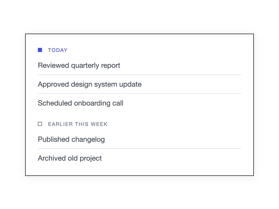
A small uppercase label with an optional square marker used to introduce or divide a group of related content, like a list section or sidebar group.
Built with React and Tailwind. Copy the prompt and paste it into Claude Code, Cursor or Lovable: your agent adds Group Label to your project and fits it to your theme.
Code
How Group Label is used: the demo's code. The component's own source comes with a free account.
Usage.tsx
"use client";

import { GroupLabel } from "@/components/ui/group-label";

export default function GroupLabelDemo() {
  return (
    <div className="w-full max-w-md border border-[var(--color-ink)] bg-[var(--color-surface)] p-6 shadow-[var(--shadow-card)] font-sans">
      <GroupLabel marker accent className="mb-3">
        Today
      </GroupLabel>
      <ul className="mb-6 flex flex-col gap-2 text-sm text-[var(--color-text-2)]">
        <li className="border-b border-[var(--color-hairline)] pb-2">
          Reviewed quarterly report
        </li>
        <li className="border-b border-[var(--color-hairline)] pb-2">
          Approved design system update
        </li>
        <li>Scheduled onboarding call</li>
      </ul>

      <GroupLabel marker className="mb-3">
        Earlier this week
      </GroupLabel>
      <ul className="flex flex-col gap-2 text-sm text-[var(--color-text-2)]">
        <li className="border-b border-[var(--color-hairline)] pb-2">
          Published changelog
        </li>
        <li>Archived old project</li>
      </ul>
    </div>
  );
}
More by enoughtools
View all
Conversation Bubble
Tool Row
Sidebar
Chart
Callout