
About
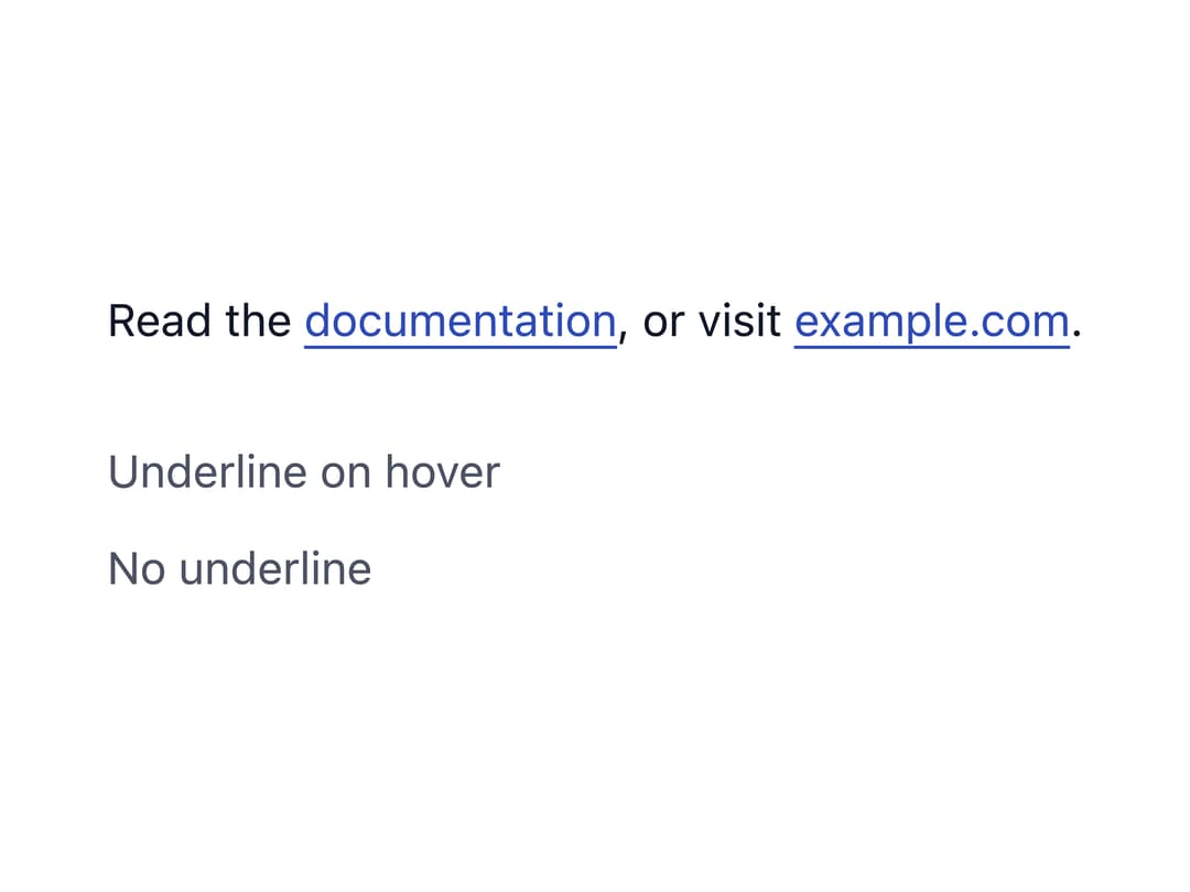
A themeable inline text link that inherits the surrounding typography, with configurable underline behavior, semantic color and an external-link mode that opens in a new tab safely.
Built with React and Tailwind. Copy the prompt and paste it into Claude Code, Cursor or Lovable: your agent adds Link to your project and fits it to your theme.
Code
How Link is used: the demo's code. The component's own source comes with a free account.
Usage.tsx
import Link from "@/components/ui/link";
import "@/components/ui/link-utils/yarcl-setup";

export default function LinkDemo() {
  return (
    <div
      className="flex max-w-md flex-col gap-6 text-sm leading-relaxed"
      style={{ color: "var(--yarcl-neutral-text)" }}
    >
      <p>
        Read the <Link href="/docs">documentation</Link>, or visit{" "}
        <Link href="https://example.com" external>
          example.com
        </Link>
        .
      </p>
      <div className="flex flex-col gap-2">
        <Link href="#" underline="hover" color="neutral">
          Underline on hover
        </Link>
        <Link href="#" underline="none" color="neutral">
          No underline
        </Link>
      </div>
    </div>
  );
}
More by eugenioenko
View all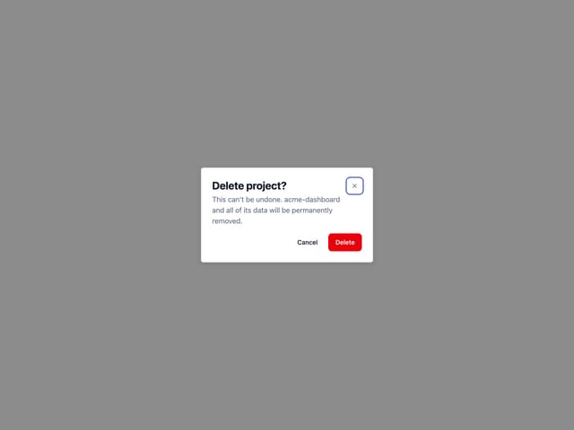
Dialog
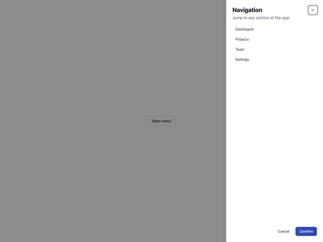
Drawer
Divider