About
A set of layered sections (tab panels) shown one at a time, built on Base UI.
Built with React and Tailwind. Copy the prompt and paste it into Claude Code, Cursor or Lovable: your agent adds Tabs to your project and fits it to your theme.
Code
How Tabs is used: the demo's code. The component's own source comes with a free account.
Usage.tsx
"use client";

import { Tabs, TabsContent, TabsList, TabsTrigger } from "@/components/ui/tabs";

export default function Default() {
  return (
    <div className="flex min-h-screen w-full items-center justify-center bg-background p-8">
      <Tabs defaultValue="account" className="w-80">
        <TabsList>
          <TabsTrigger value="account">Account</TabsTrigger>
          <TabsTrigger value="password">Password</TabsTrigger>
        </TabsList>
        <TabsContent value="account">Account settings here.</TabsContent>
        <TabsContent value="password">Change your password here.</TabsContent>
      </Tabs>
    </div>
  );
}
Dependencies
More by Extend
View all

Bounding Box Citations
51
Layout Blocks
13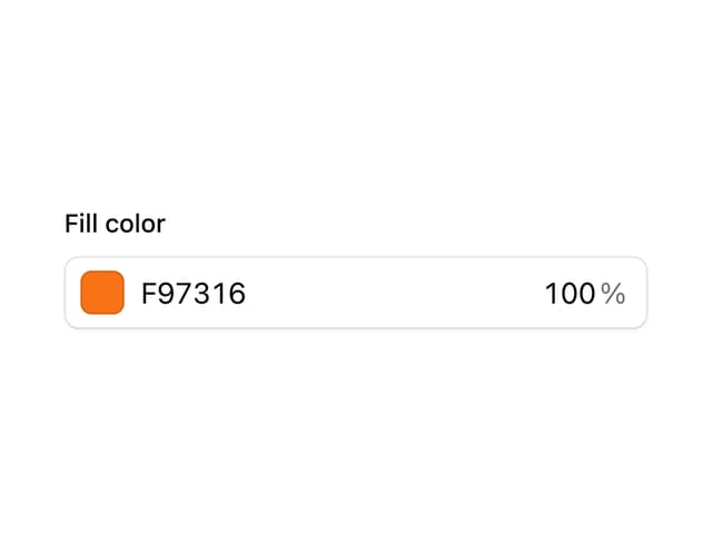
Color Picker
5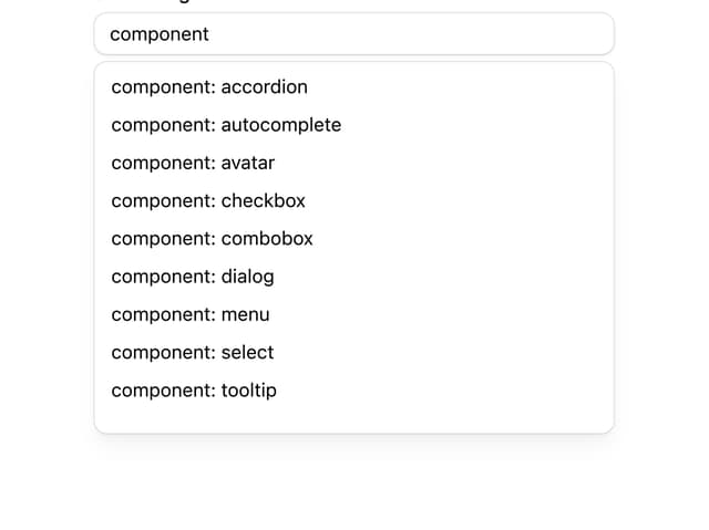
Autocomplete
Tooltip
Popover
Separator
Input
More in Navigation
View all

Sidebar
235
Navbar with Theme Toggle
43

Sidebar
339

Tabs
60
Numberless Pagination with Text
11
Oversized 404 Numeral
50
Footer
446
Pagination
43


